Creative Aid
Winter 2015A website for the nonprofit organization Creative Aid.
2016
Scout is an application, made by University of Washington Information Technology, that aims to help students find places to eat, places to study and Student Technology Fee funded items on campus. I worked on Scout for several months as a researcher and designer.
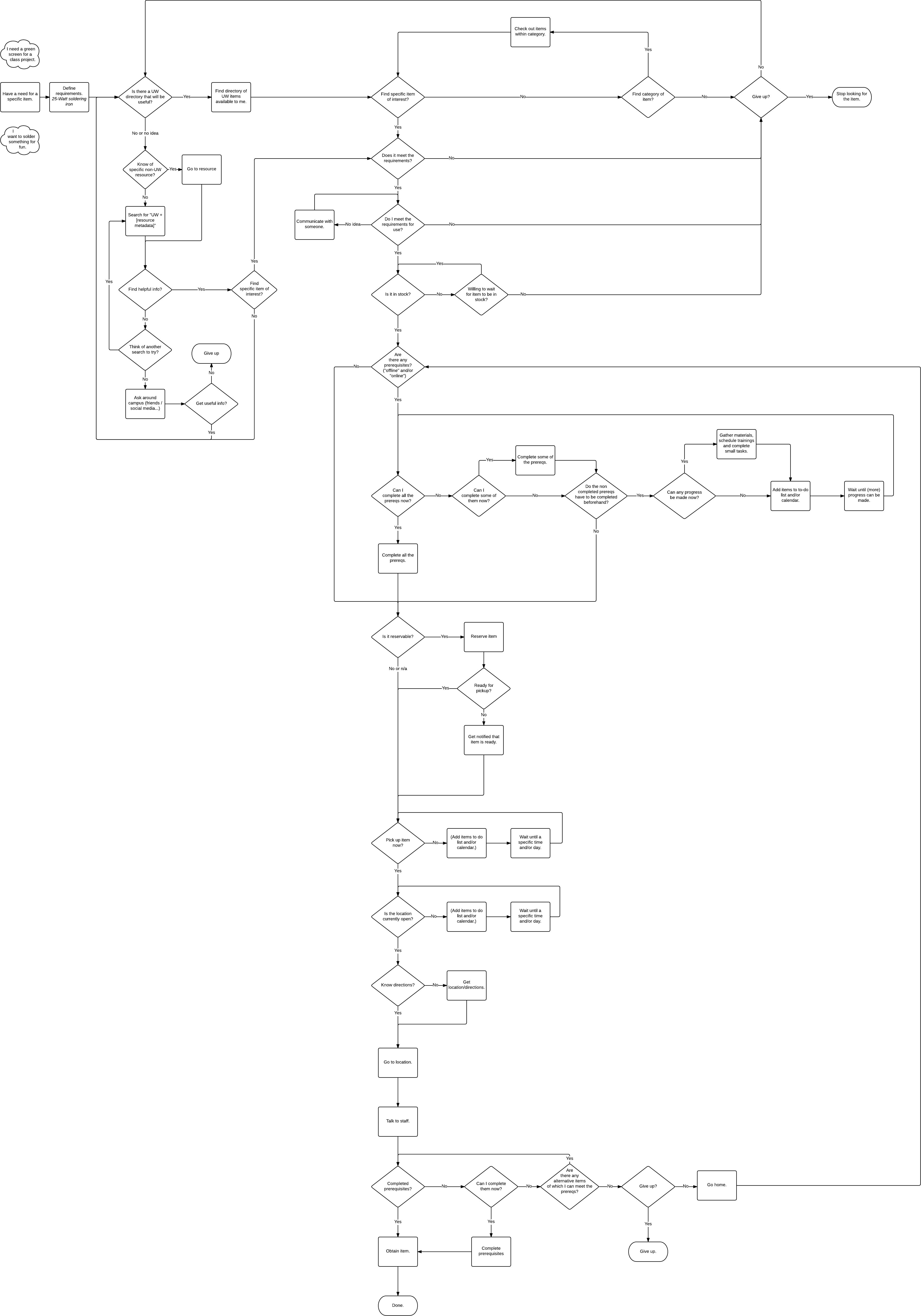
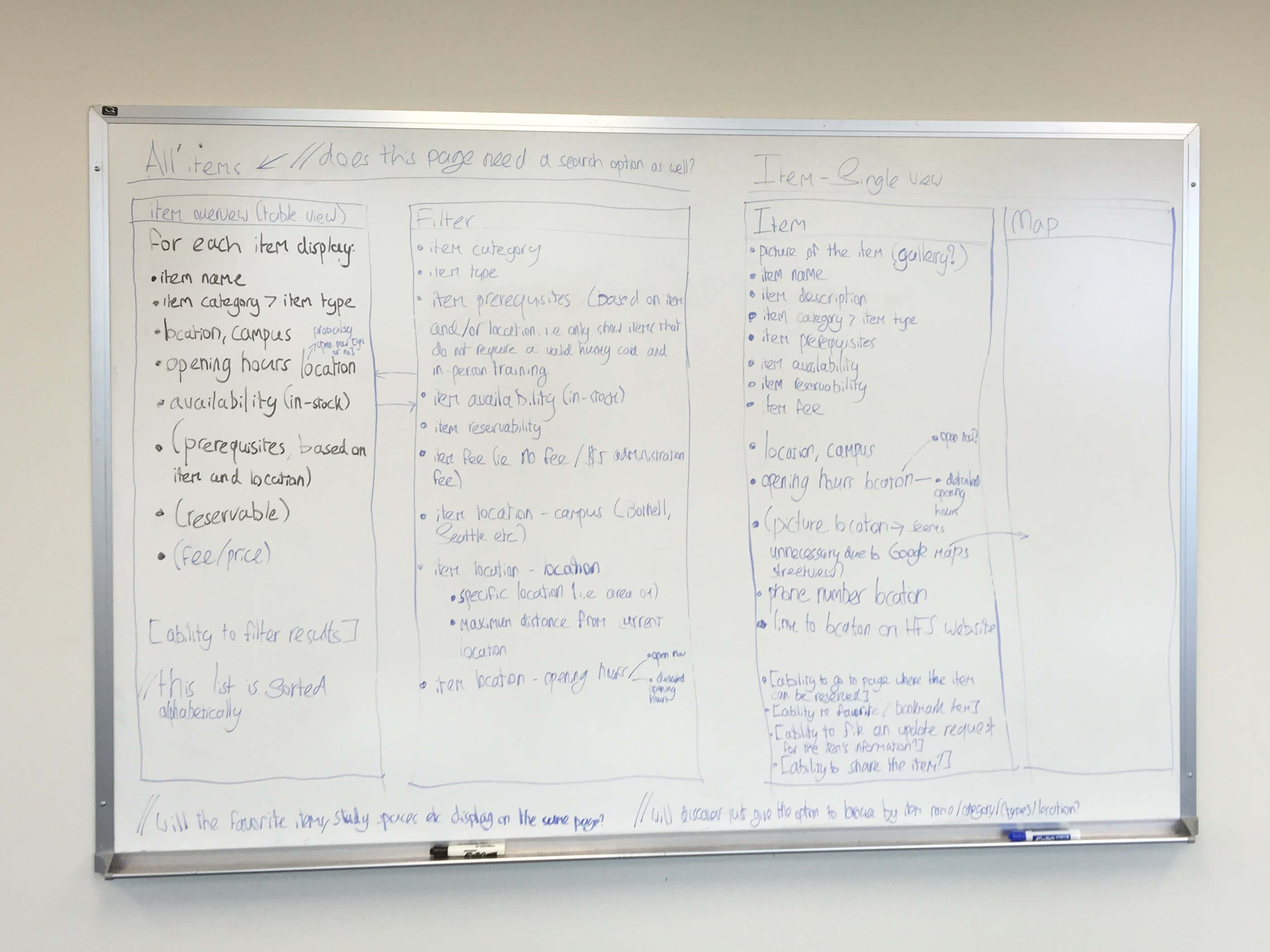
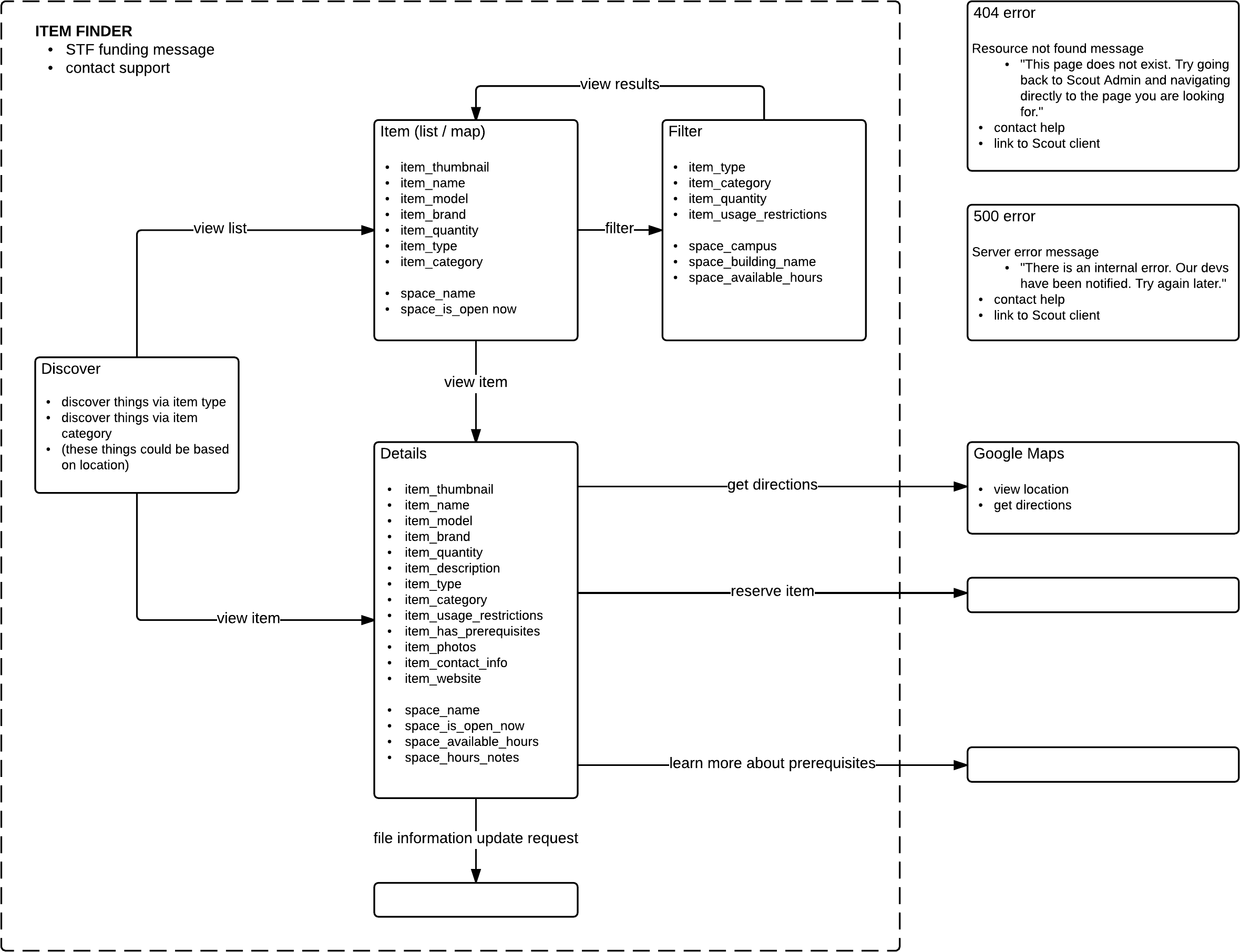
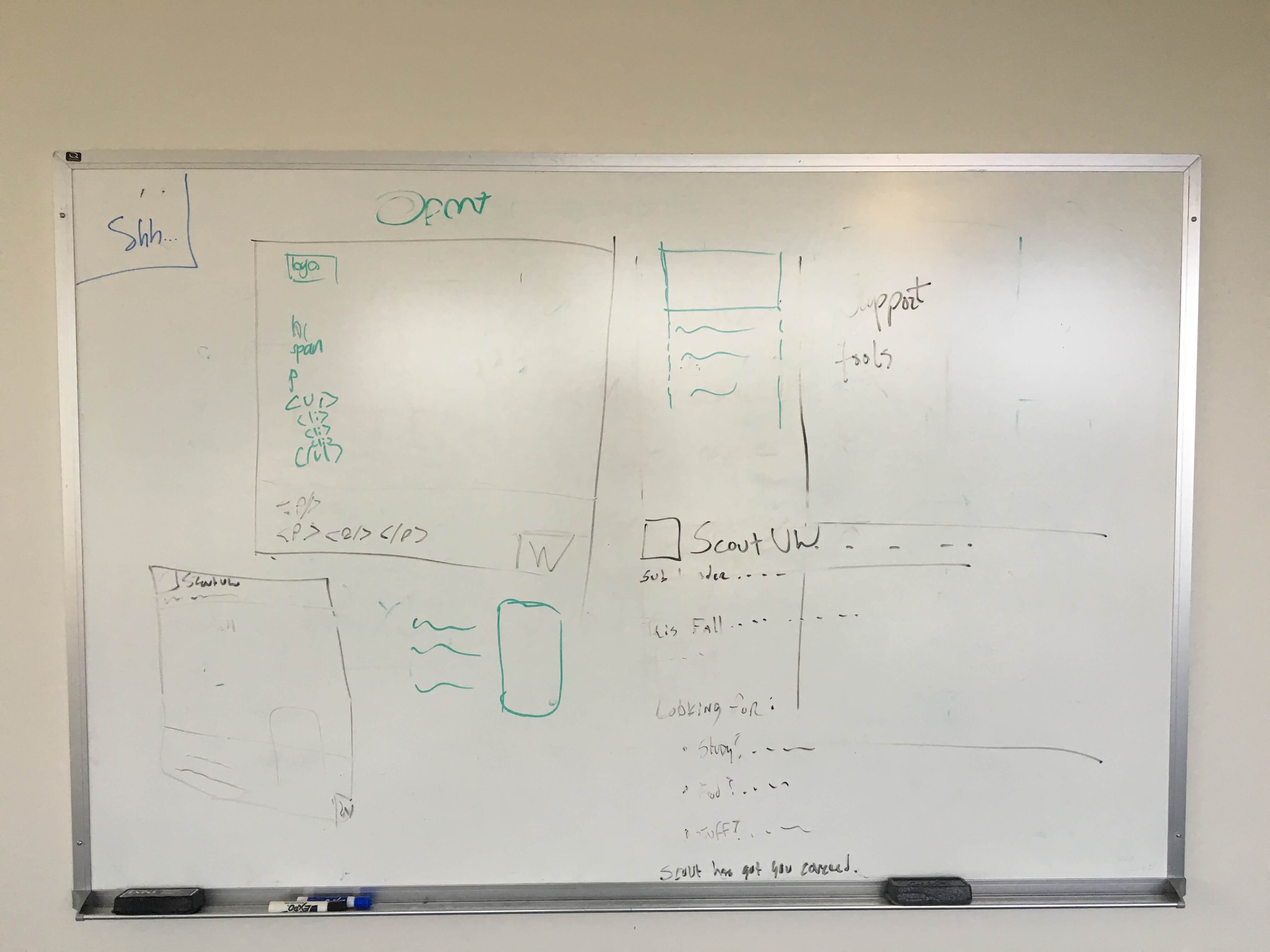
One of my first responsibilities was capturing how students go about finding items on campus. I did this using a user flow diagram and subsequently defined what information Scout's different pages needed to display to aid students in their search.
The rest of the team had focused on the part of Scout that needed to help students find food on campus. Once they finished a minimum viable product, I conducted two user studies on campus together with Dr. Henry Lyle, a researcher at UW-IT. For both of these studies, we interviewed around ten random students.
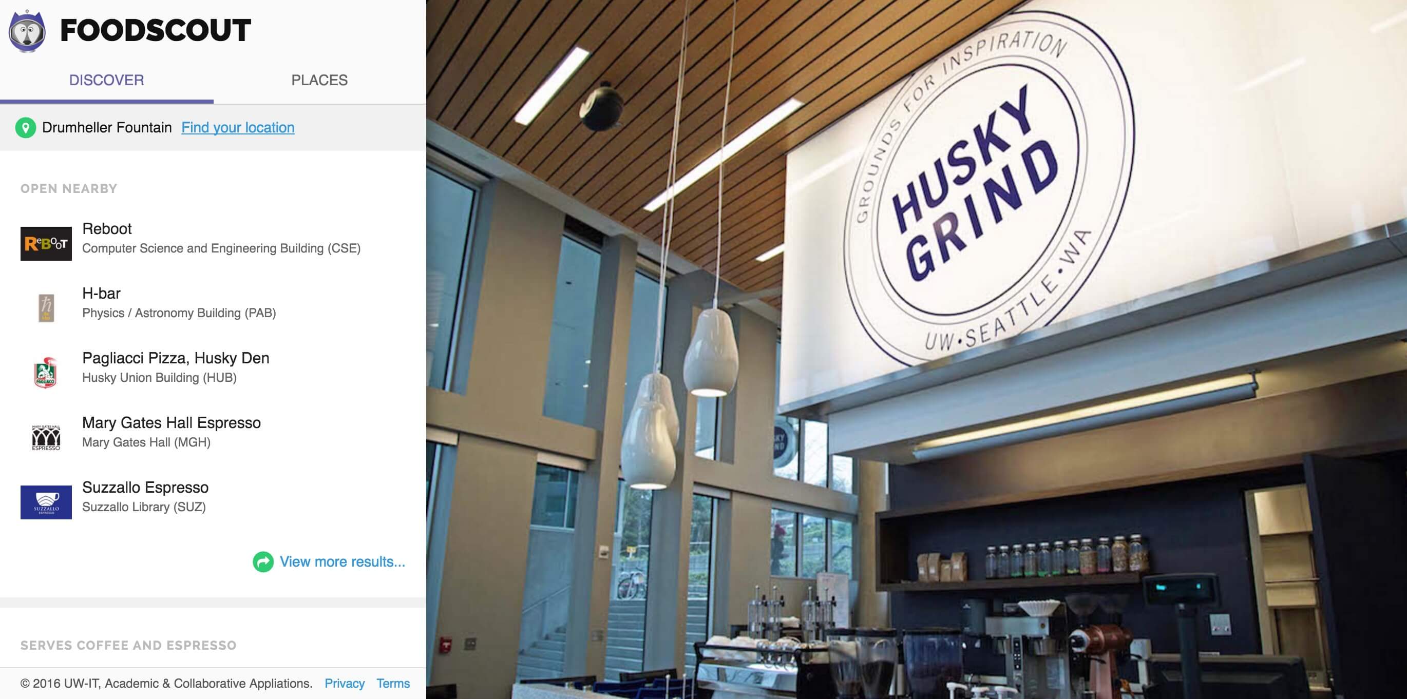
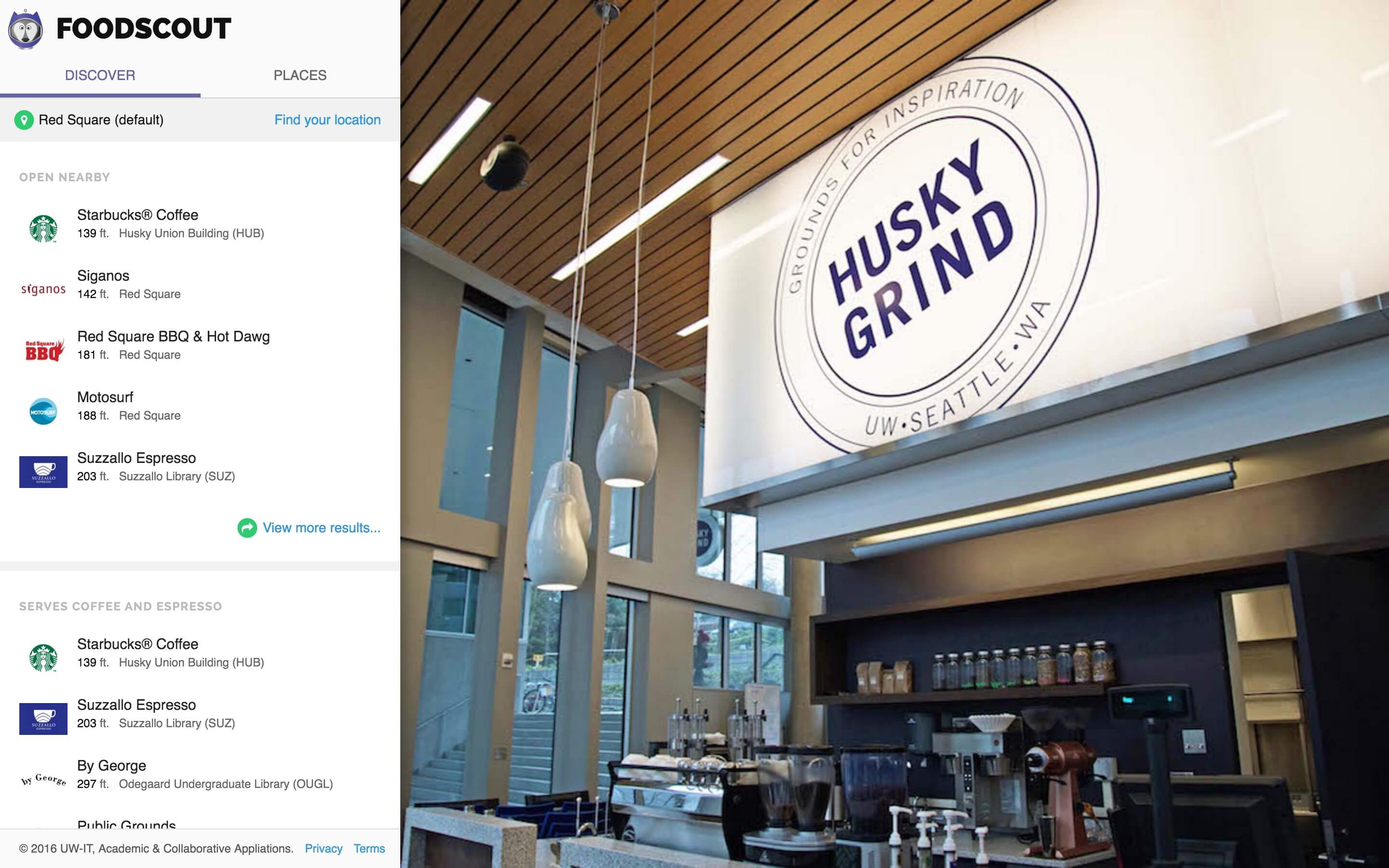
Our first study showed that students were unable to find nearby food places that served specific types of food. They did not share their location and as a result Scout never listed food places that were nearby. Dr. Lyle and I identified users mistaking the default location for their current location as the problem. This misunderstanding made users not share their location and receive suboptimal suggestions.
After documenting the study's results, I tried to address the encountered problem by changing the design of Scout's location services. I changed users' default location from an arbitrary landmark, Drumheller Fountain, to Red Square, the busiest and most central place on campus. Furthermore, I used iconography and language to show that a default location and a shared location are not one and the same. Lastly, I used spacing to emphasize the action of sharing a location.


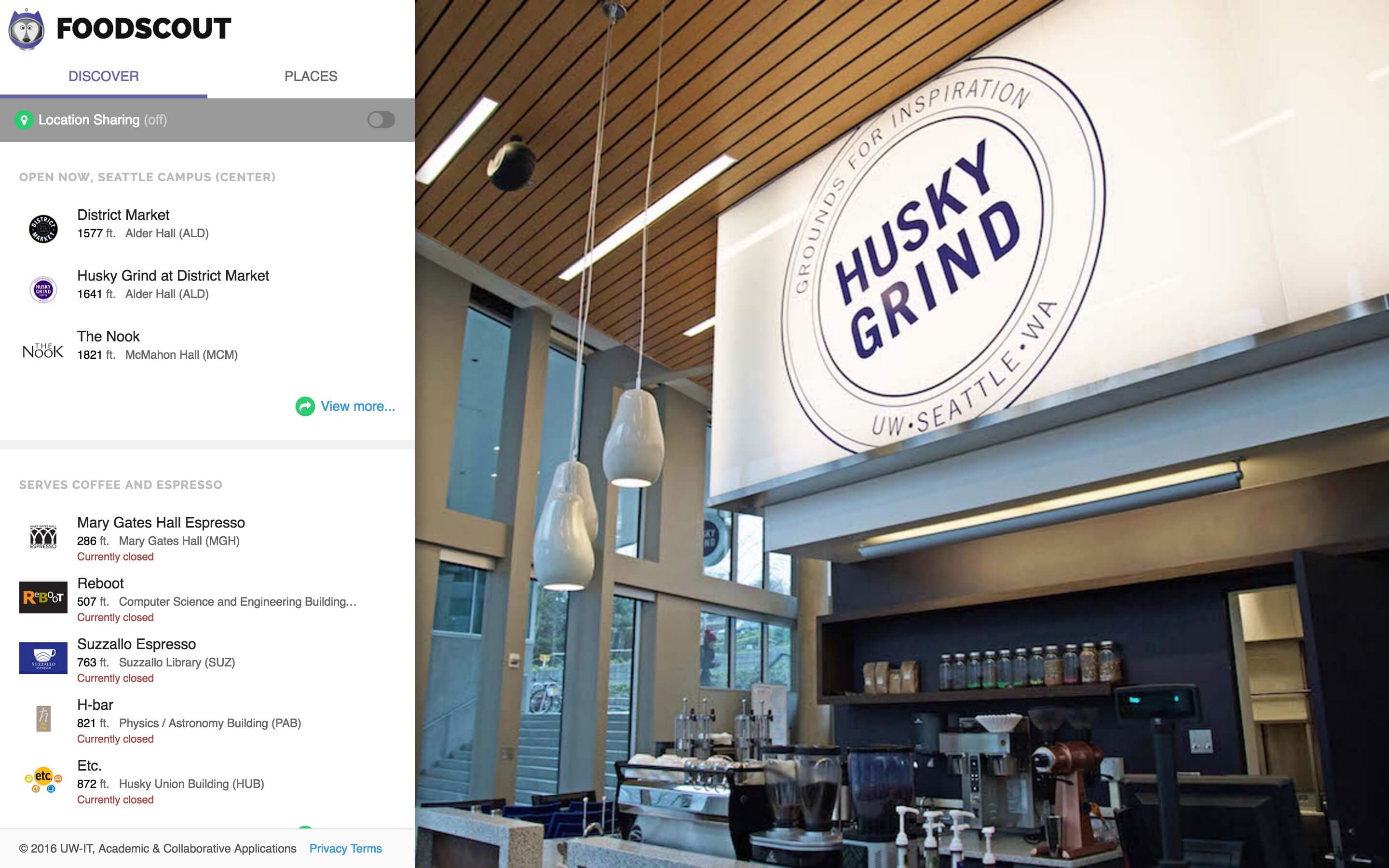
The results of our second study indicated that the users were still confused by Scout's location services. They did not share their location, because they either missed the location bar or did not understand the options that were presented to them. In both cases, they thought that the application was already using their location.
After our second study, I tried to make more radical changes. I made the location bar more prominent and made the action of enabling location services much more explicit by turning the old design's link into a switch. Furthermore, I used text to clarify what location the app was basing its suggestions on.
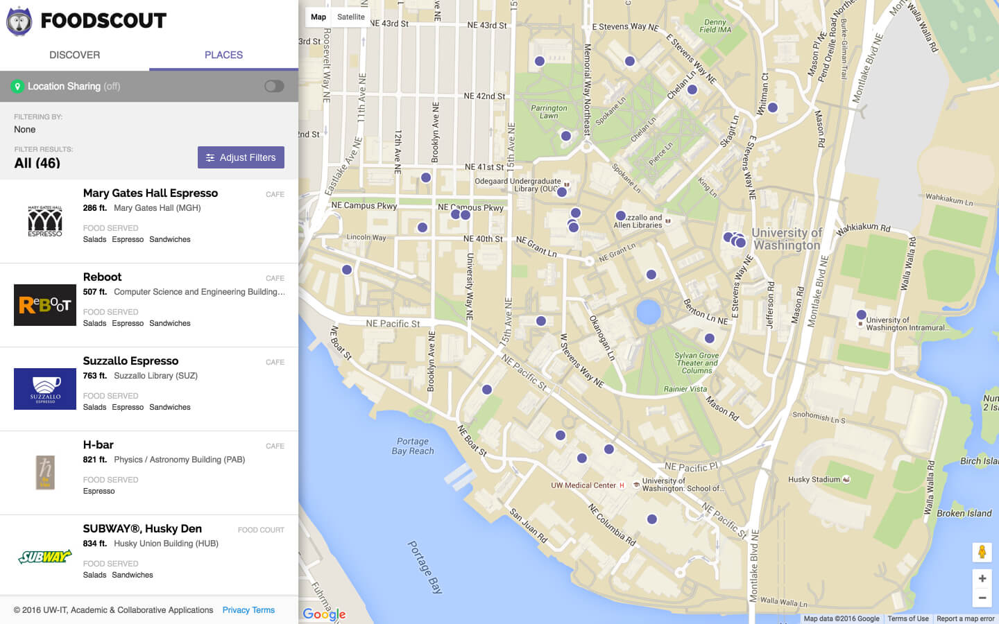
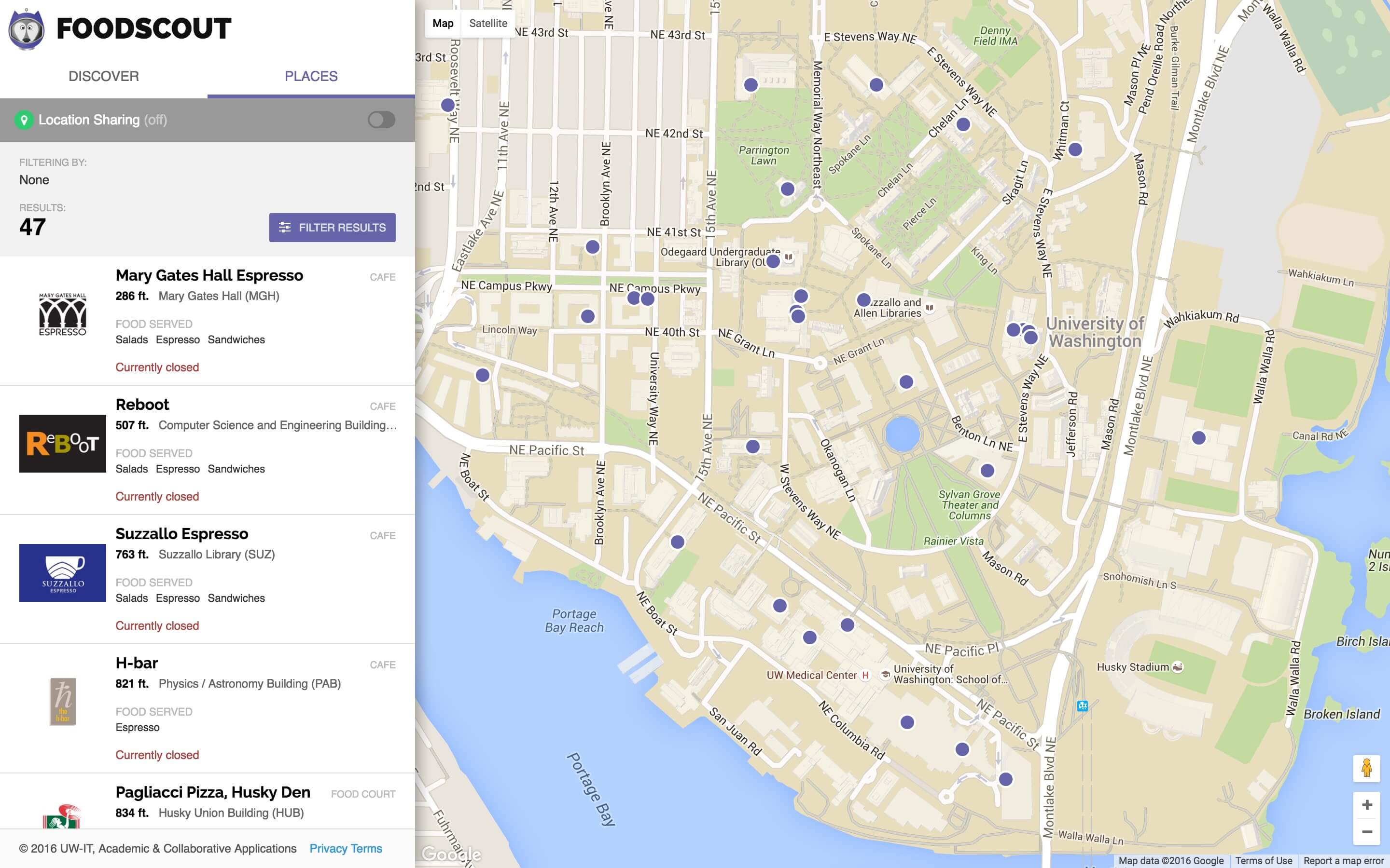
Our second study also brought to light another problem: users did not understand the page that had to help them find specific food places. The initial state, which showed all the food places on campus, was confusing to them. They also overlooked the option to narrow down results using filters. This resulted in inefficient workflows, such as reviewing every result in the initial list when asked to find a nearby food place that served Chinese food.
The changes I subsequently made had to help users realize that the first list that was shown listed all of the food places on campus. My changes also had to improve the filters' discoverability.

http://scout.vincentmvdm.com/
https://github.com/uw-it-aca/scout_landing_page
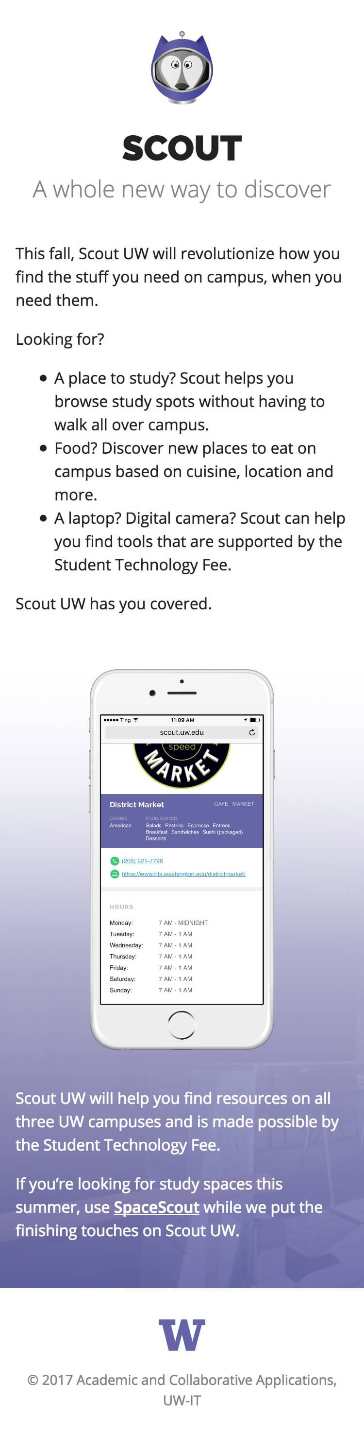
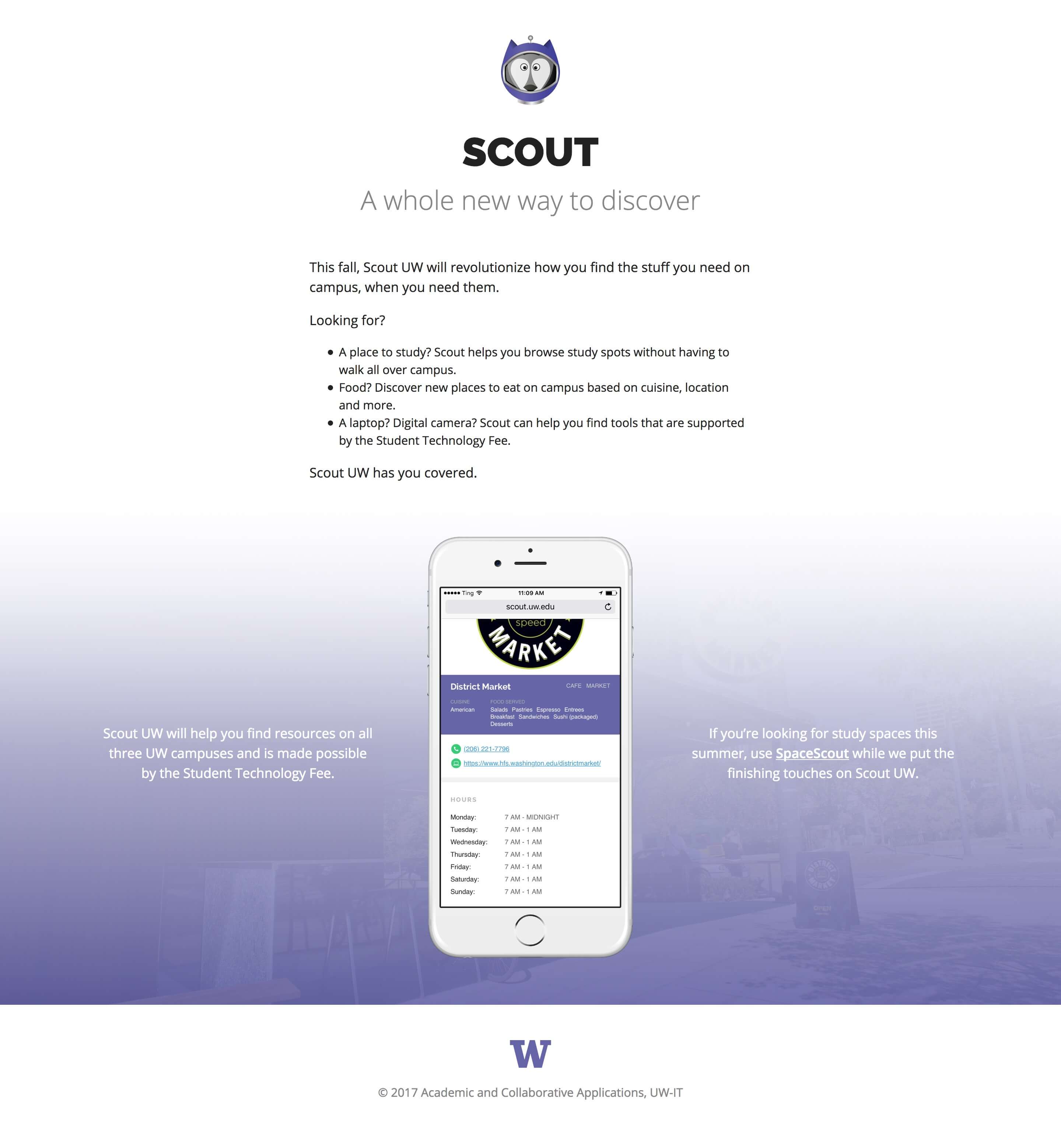
I was given the opportunity to make the landing page that needed to inform incoming freshmen about Scout. I was responsible for both the design and the development of the page.
Scout took up a large part of my first year as a designer at UW-IT. My work on mapping the item finding process was one of my first exercises in trusting that good process will result in good design. It convinced me that it is indeed better to start off with low fidelity deliverables as opposed to jumping to visual design.
It is difficult to be objective and make rational decisions when you and your team have been working on something for several months.
The usability tests I did together with Dr. Henry Lyle were a good reminder that it is crucial to get out of the office and get products in the hands of real users, for it is difficult to be objective and make rational decisions when you and your team have been working on something for several months.
Lastly, having my manager, Jason Civjan, look over my code for the landing page made me aware that making websites accessible is a skill of its own, and one that is important to learn. It also served as a good reminder that page speed is a commonly overlooked, yet crucial factor in a website's success.