Perduko
Fall 2015A design for a financial management app for University of Washington students.
Fall 2016
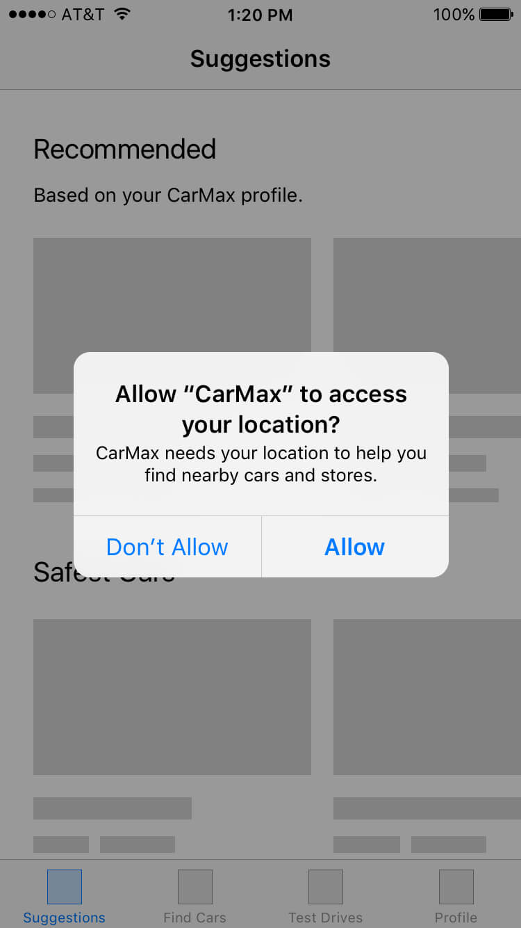
In Autumn 2016, I took the class INFO 360: Design Thinking, taught by Amazon Senior User Experience Manager Jason Levine. As our final project, my team and I made a prototype for an iPhone app for used-car retailer CarMax.
Picking the right car is difficult, because there are a lot of options. Customers often feel the need to visit multiple car dealerships before making a choice. As a result, buying a car becomes a stressful experience. A consequence for car dealerships is that visiting customers are likely to purchase a car elsewhere.
We set out to make the car selection process less stressful for customers by making it easier for them to narrow down their options and schedule test drives.
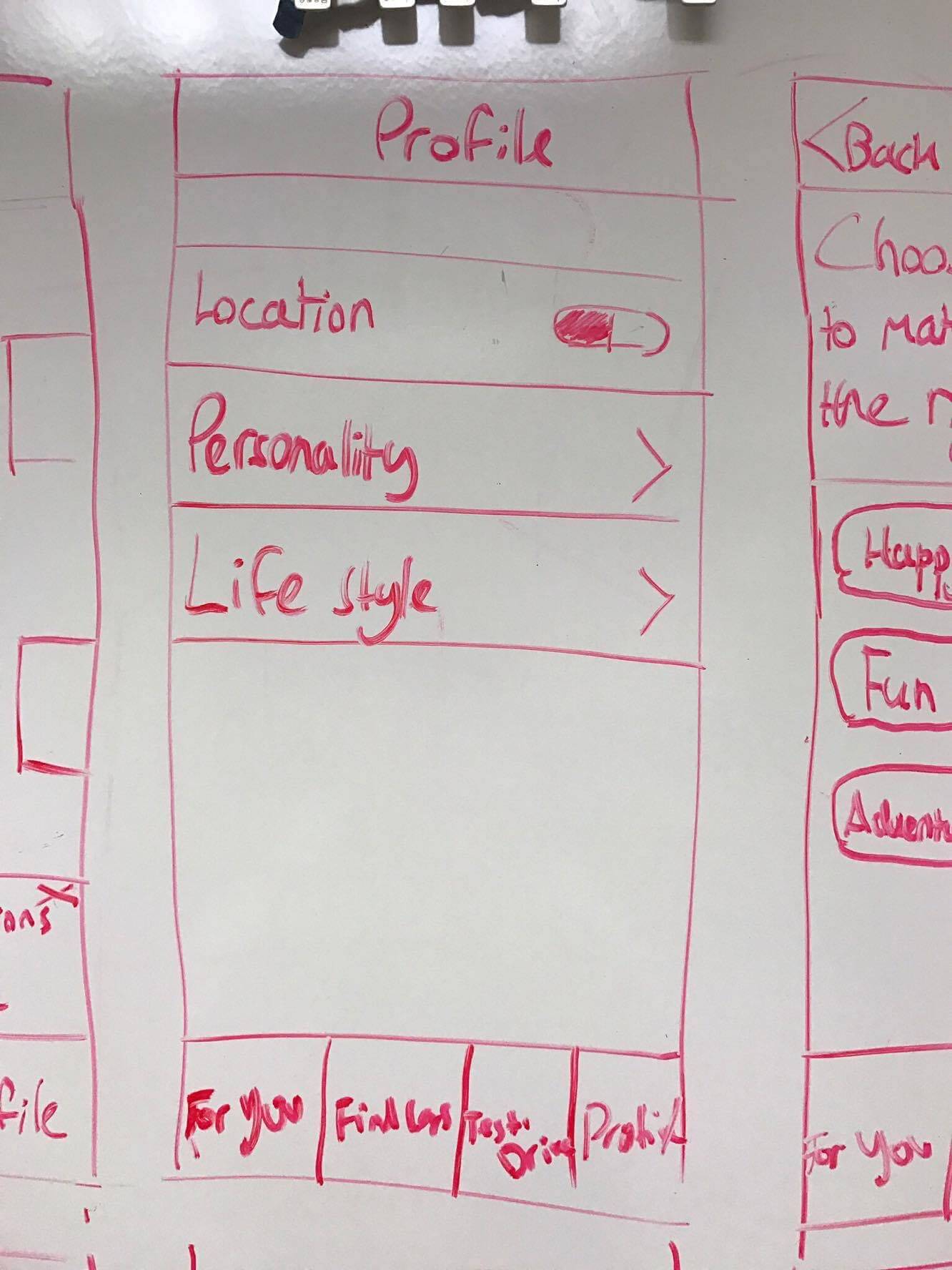
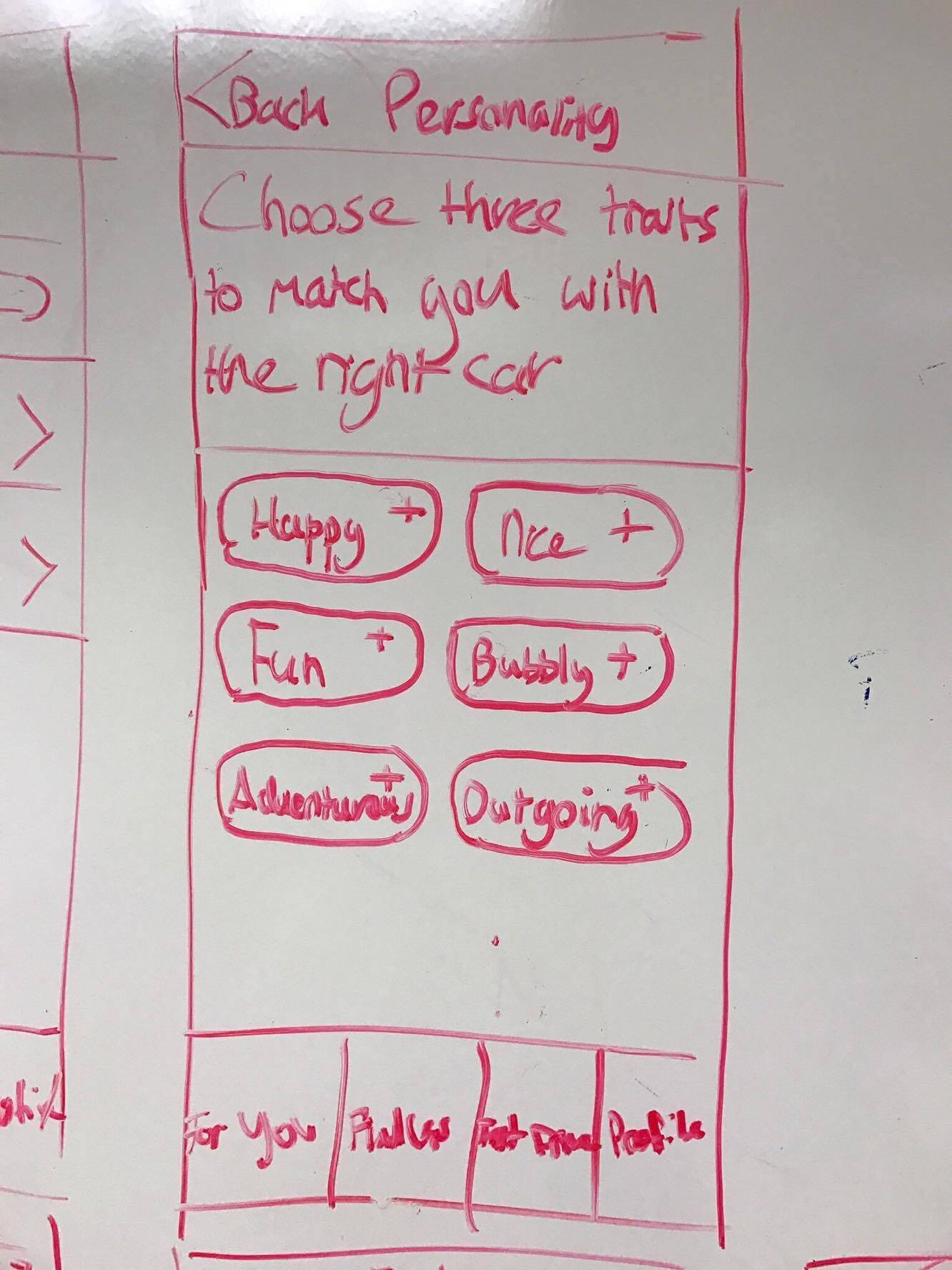
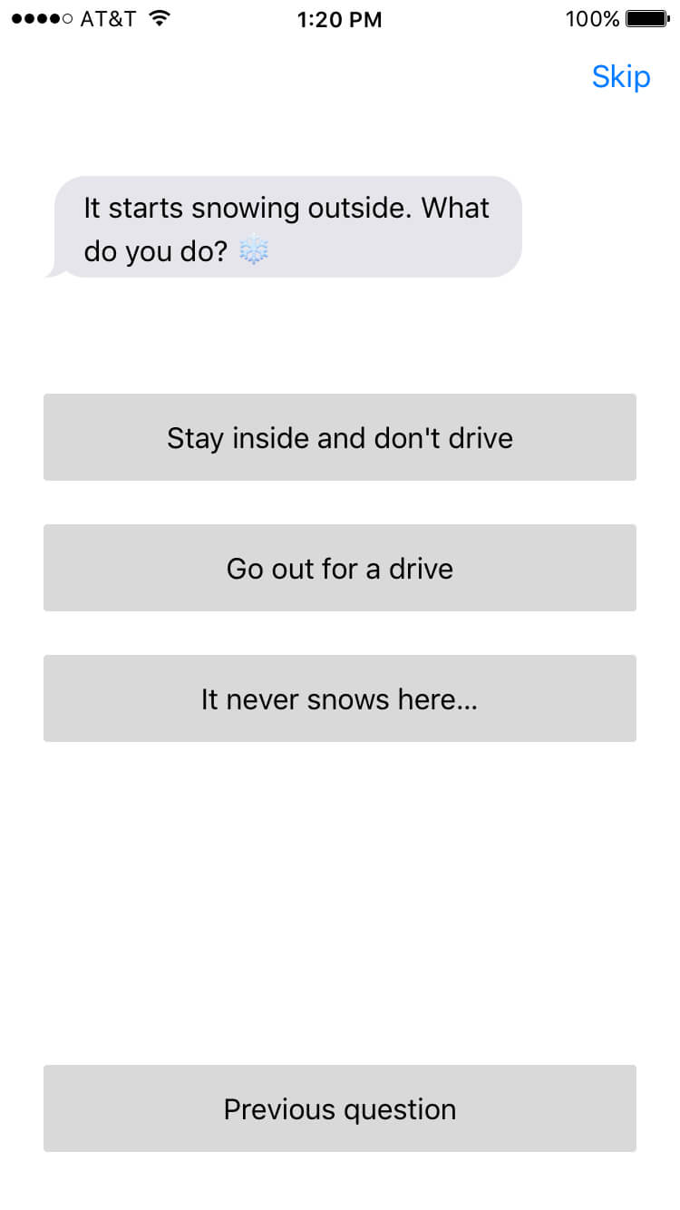
As part of the project brief, we were given two personas that represented possible users of our app. We derived a list of use cases from their descriptions. Perhaps the most interesting use case on this list was that users had to be able to find cars that fit their personality.
After studying the problem and defining the needs/desires of our users, our first step was to take four hours to come up with ideas and sketch possible solutions to the problem.
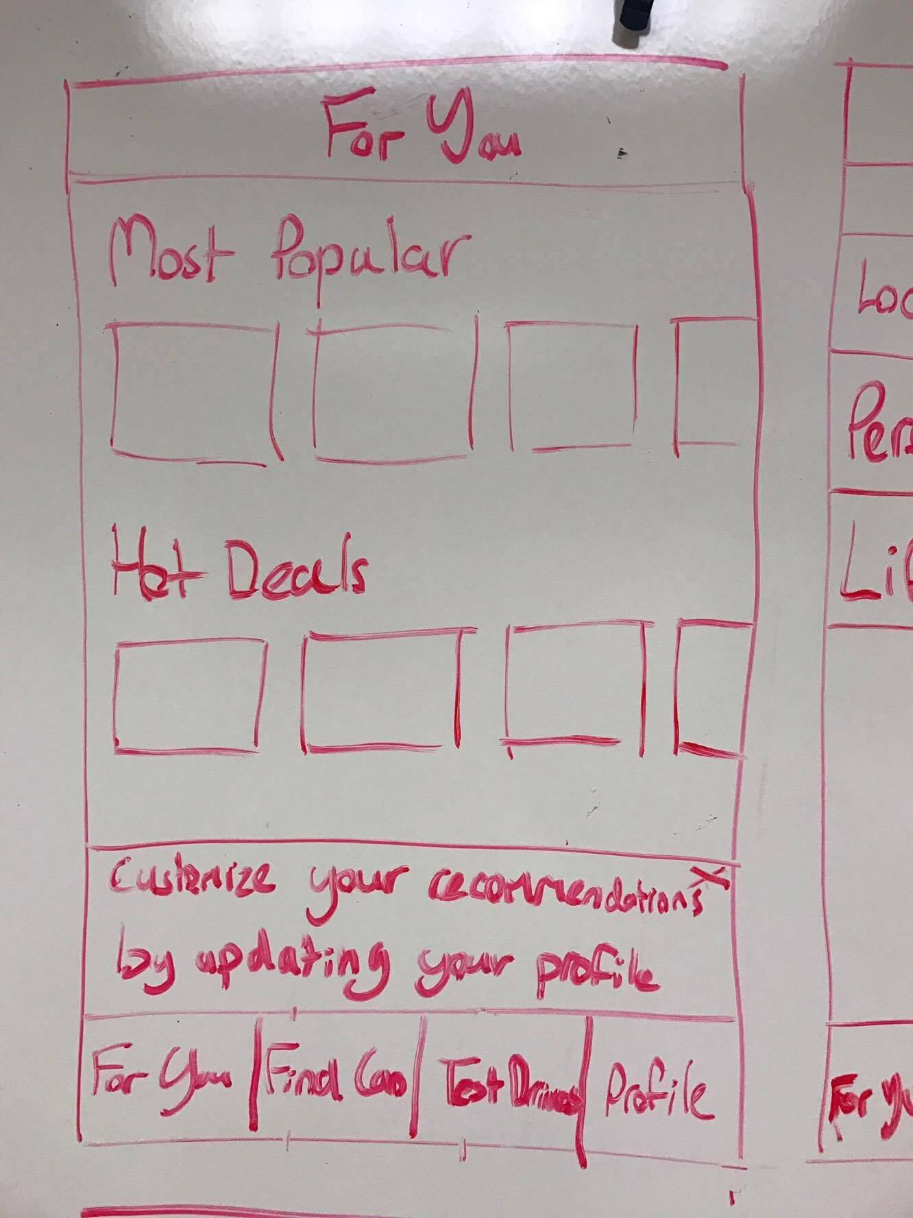
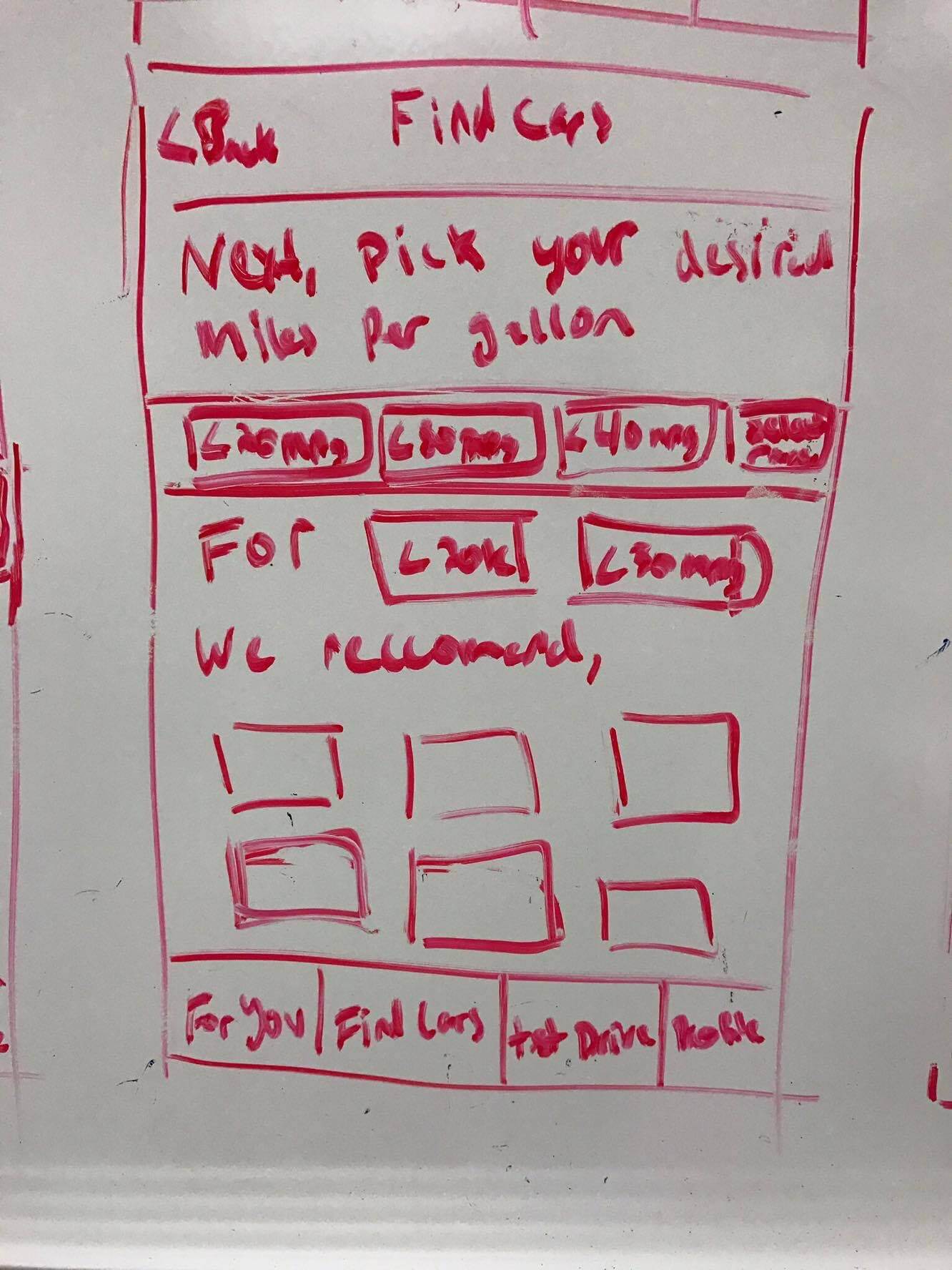
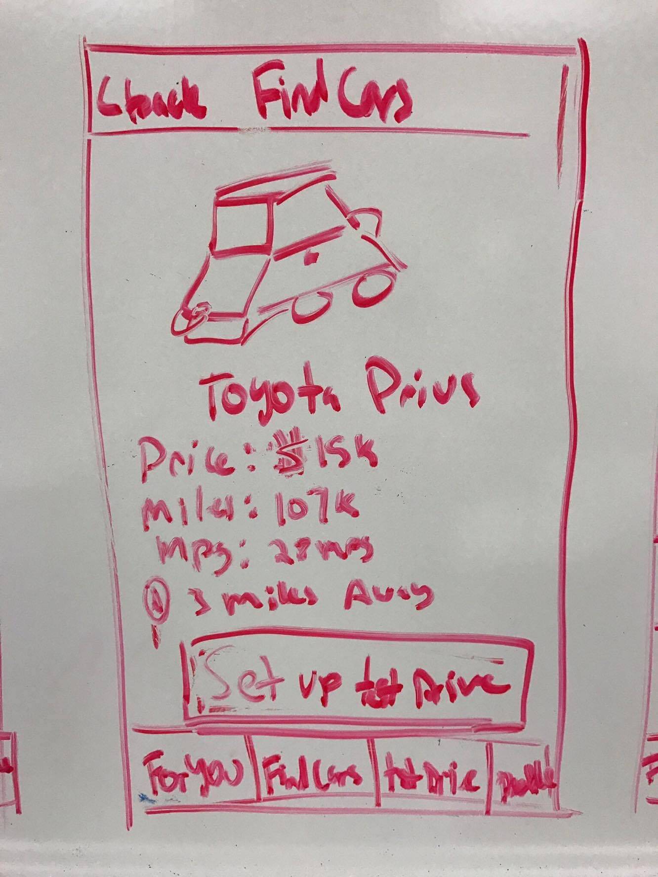
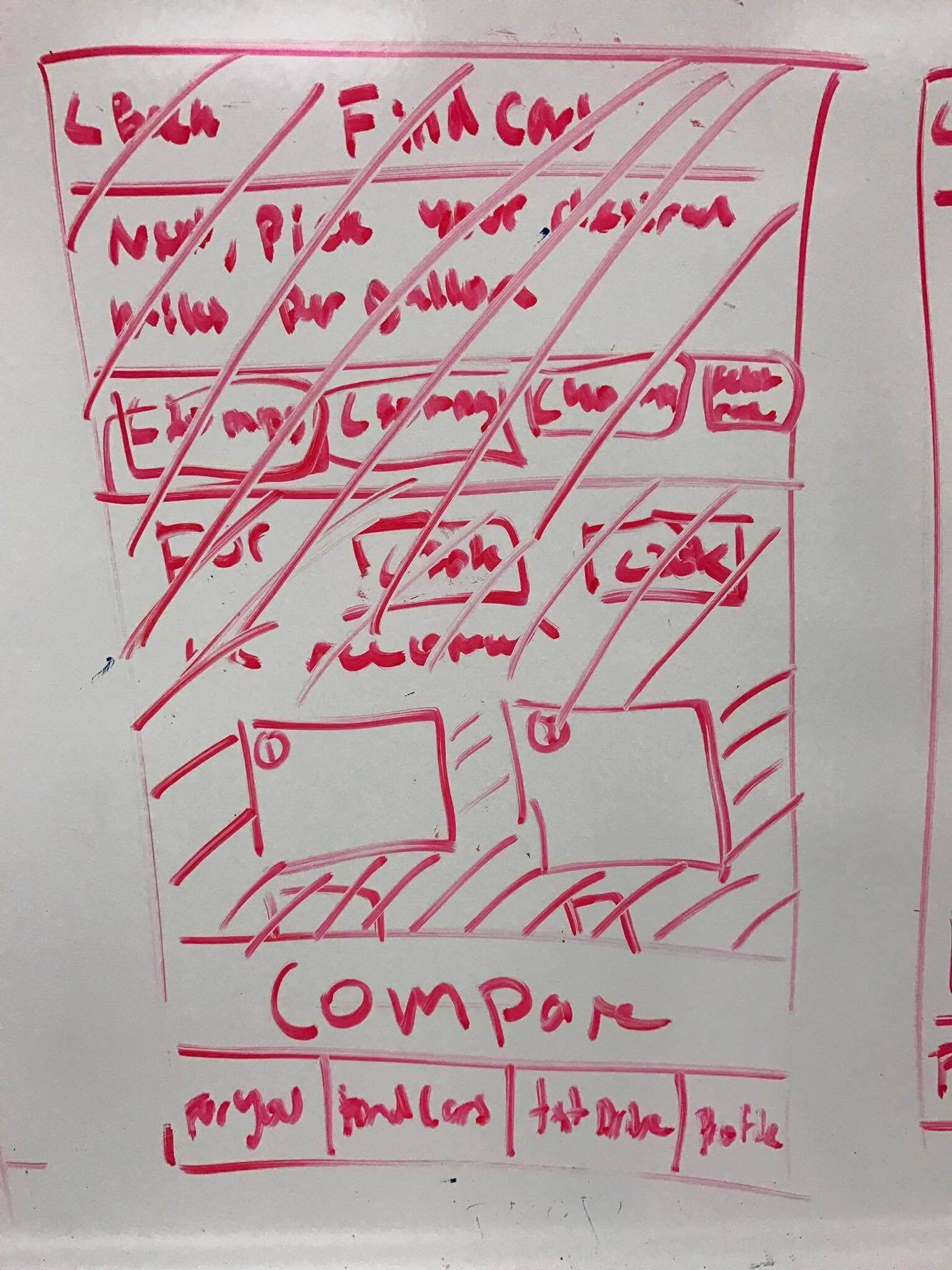
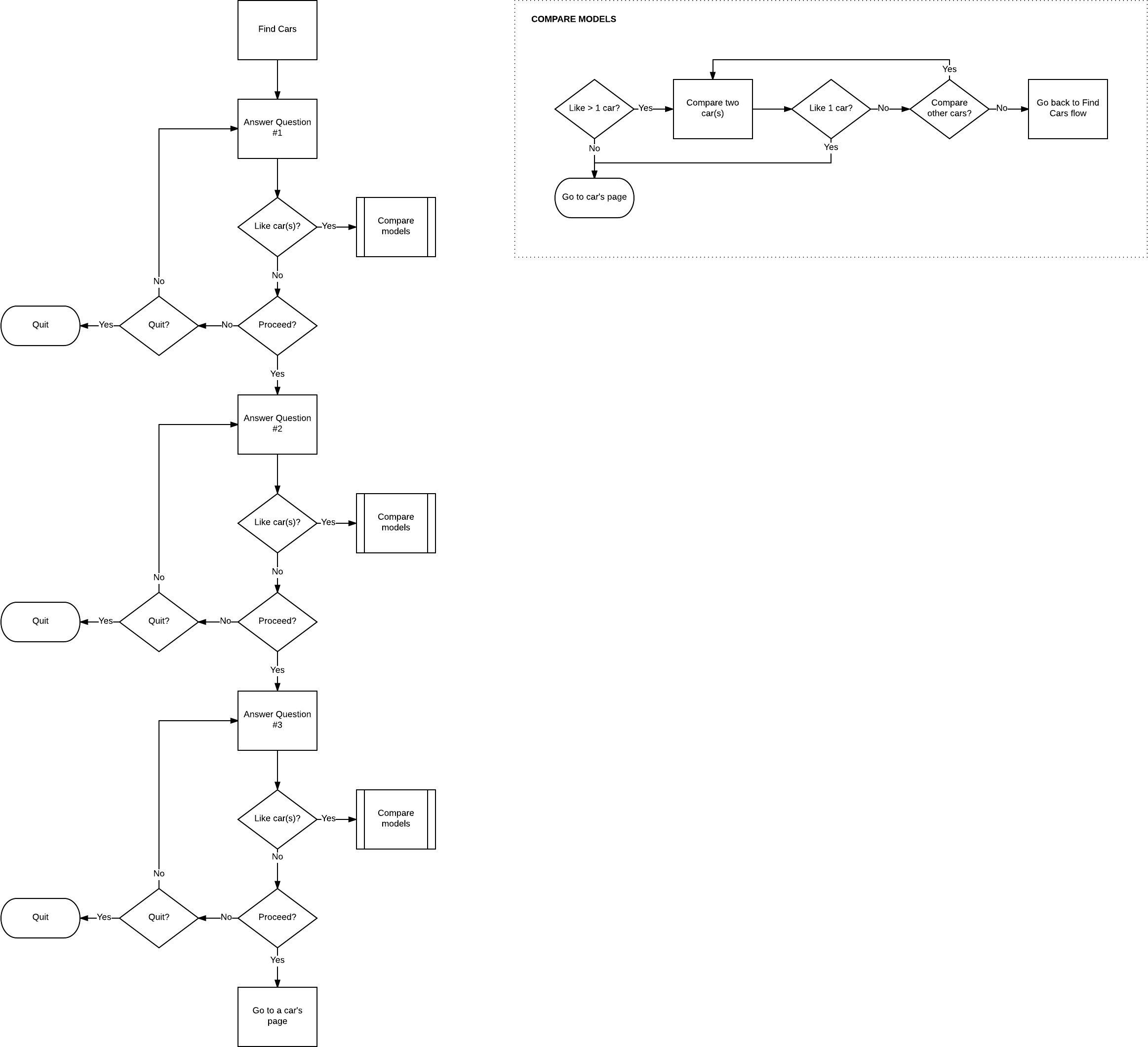
We tried to increase our understanding of what we regarded as the most complicated use case: finding a car by filtering by requirements and comparing models to each other. We did this by developing a user flow for it. This user flow, and the whiteboard sketches we had made earlier, formed the basis for the paper prototypes that we subsequently made.
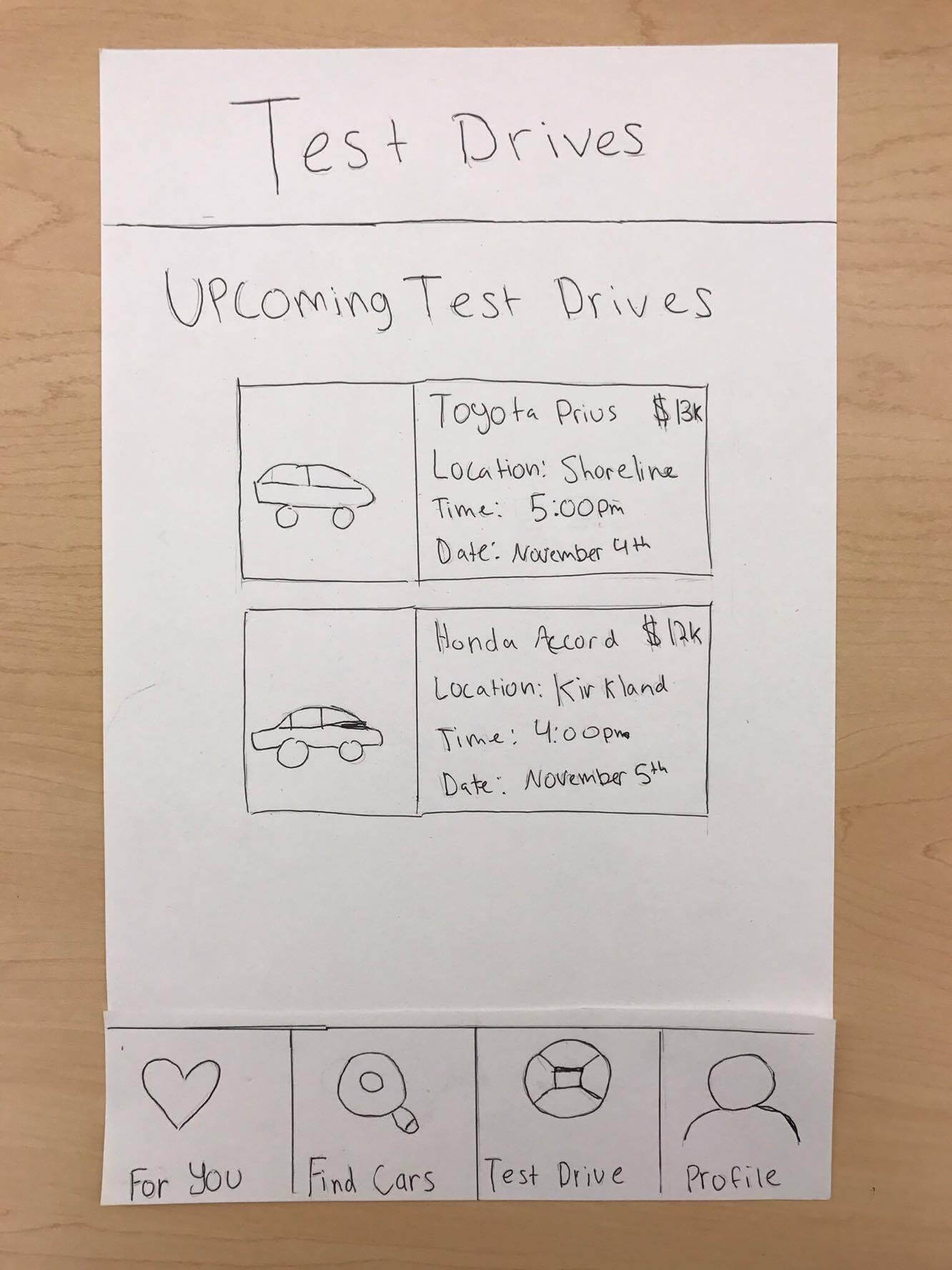
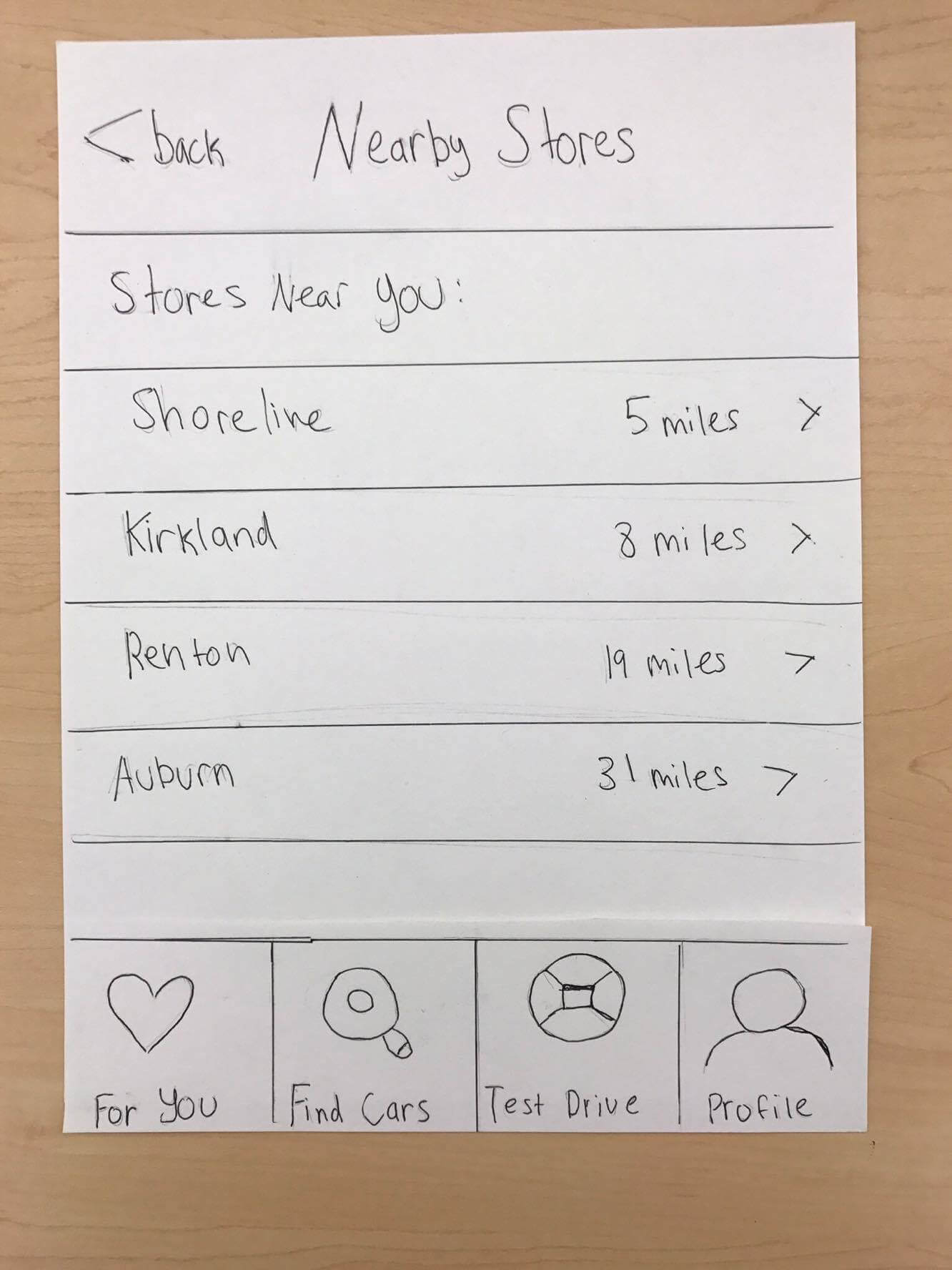
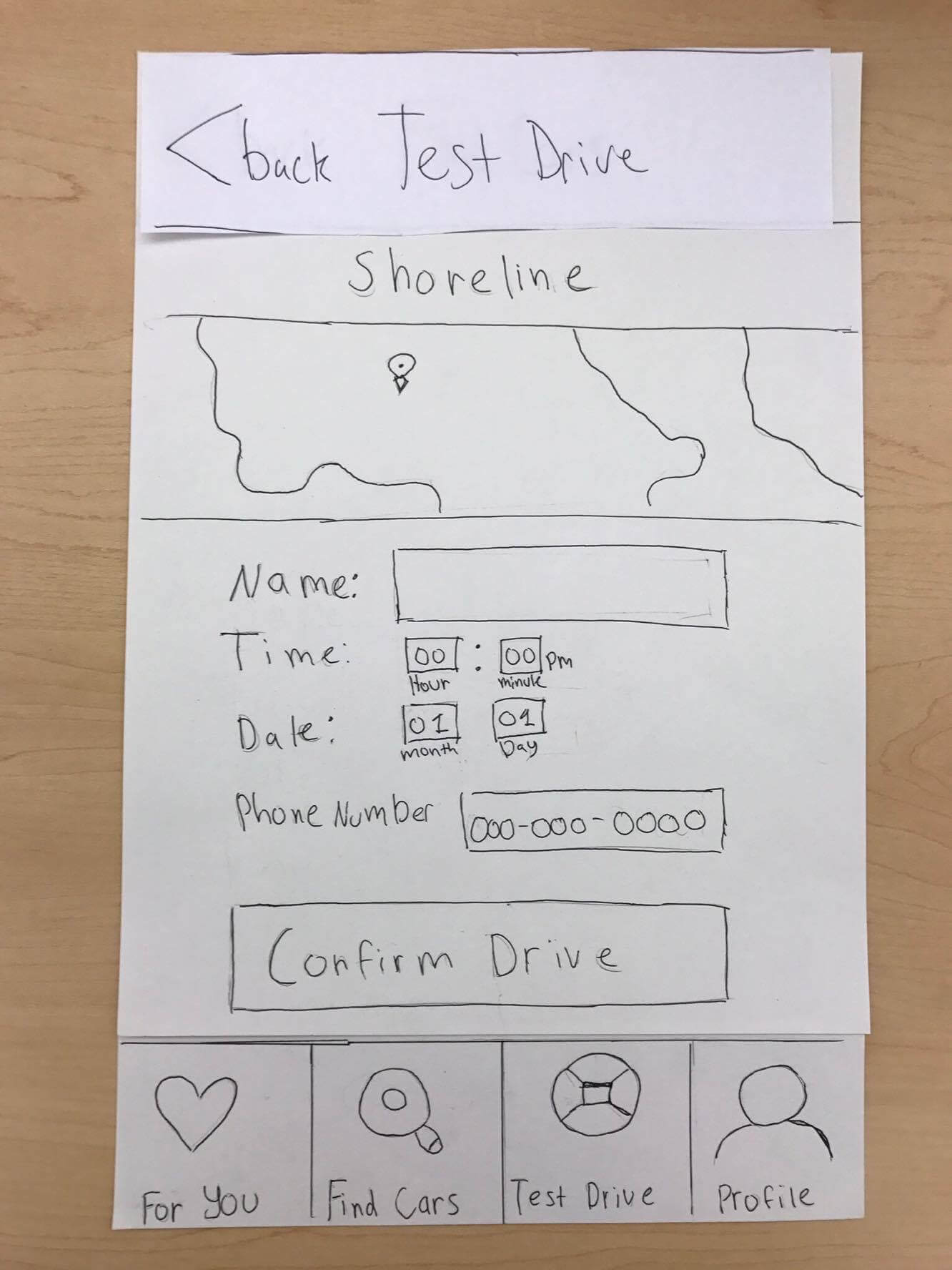
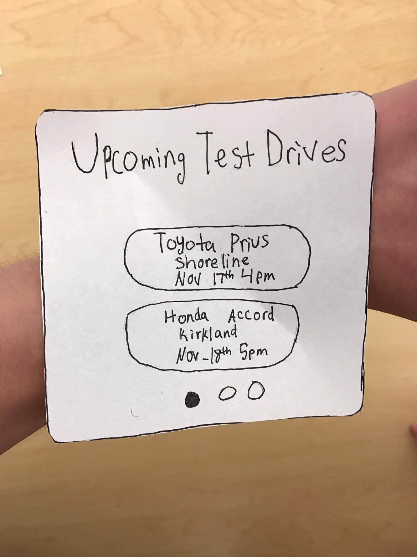
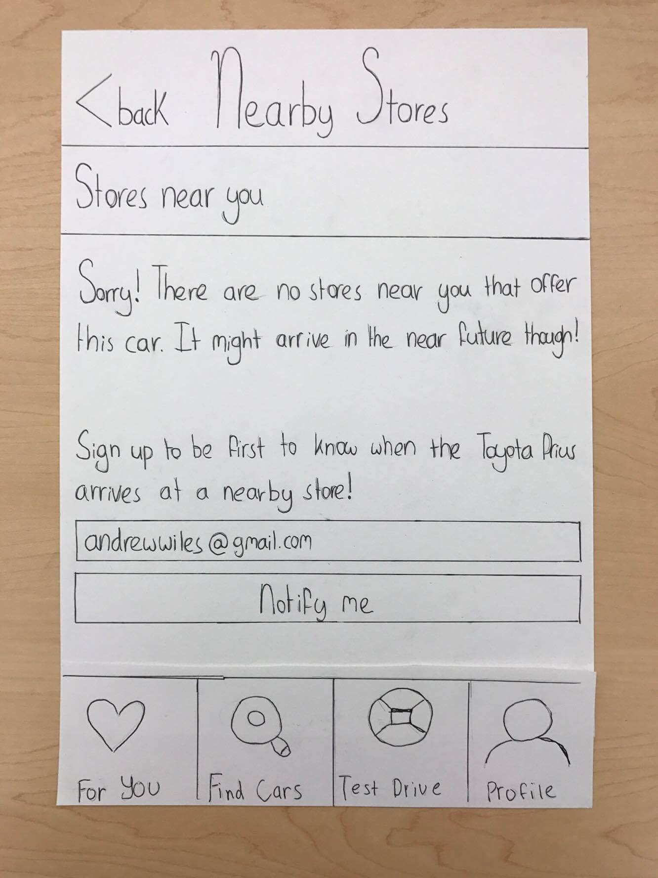
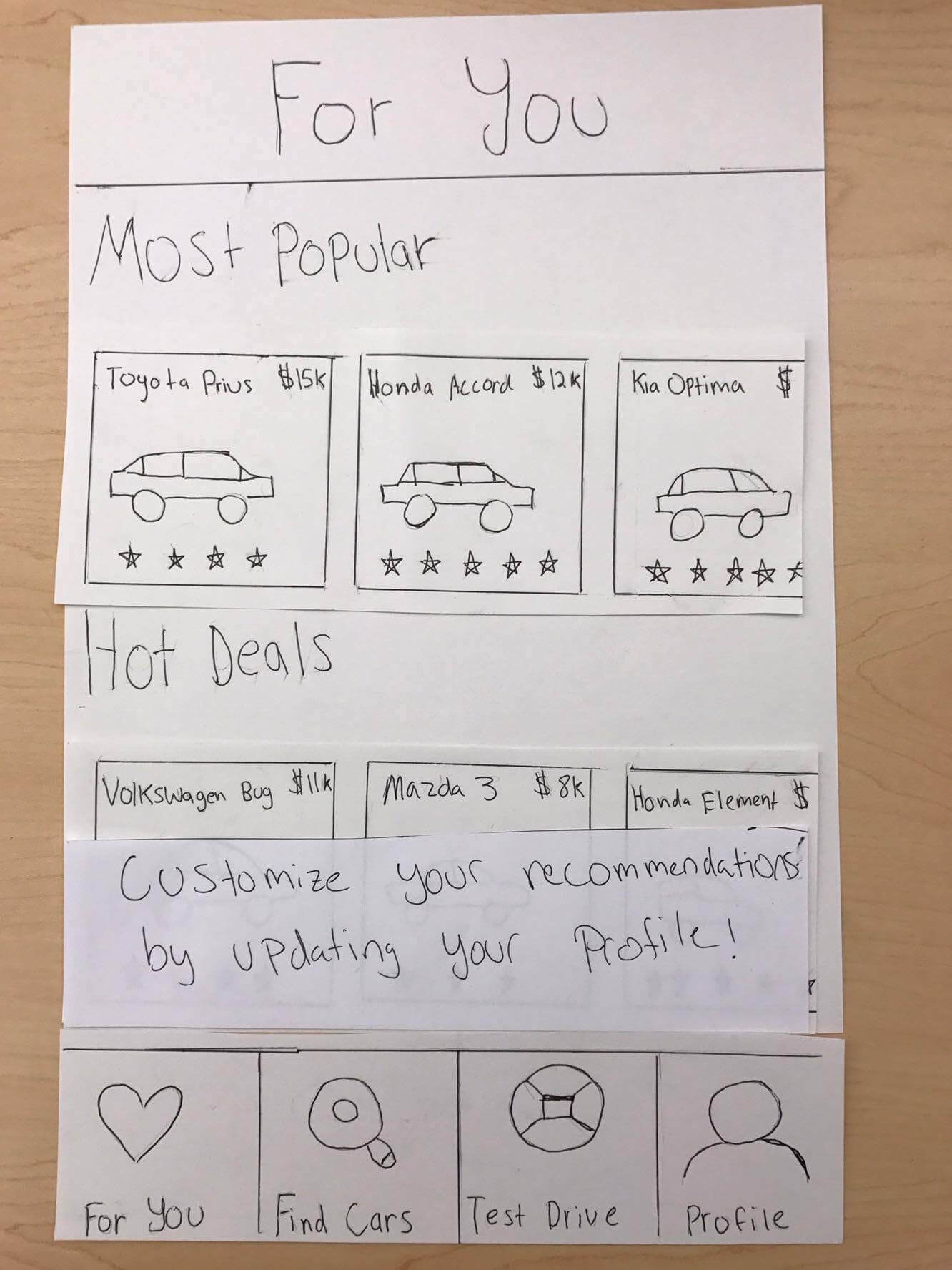
Our paper prototypes made it relatively easy to create wireframes of the app. We expanded upon them by, among other things, fleshing out the app's onboarding as well as other verbose parts that we had only briefly discussed earlier.
The wireframes allowed us to quickly make a functioning prototype using Flinto. Finishing our first digital prototype was a major milestone, since it meant that people could interact with our design in a realistic way and provide feedback.
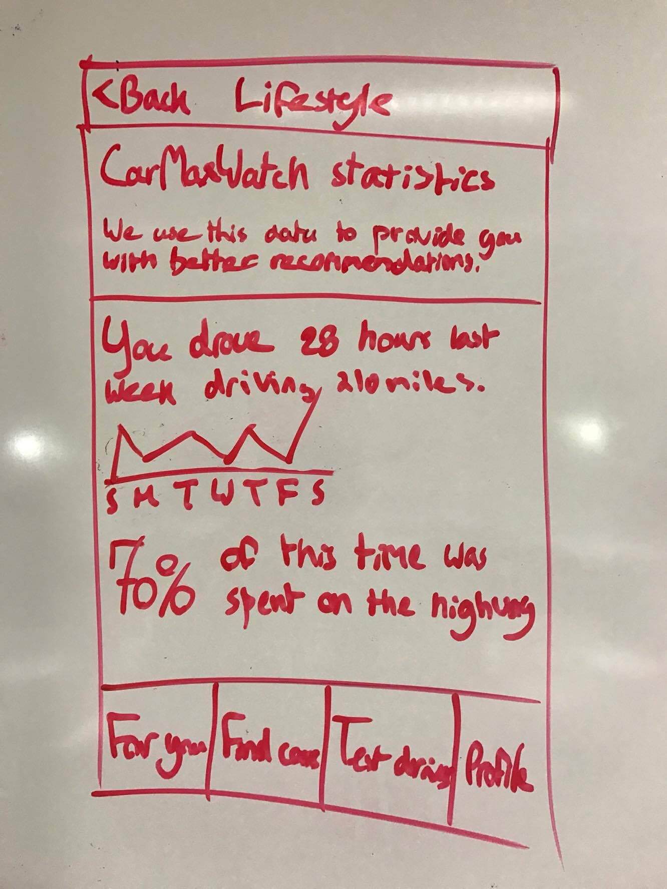
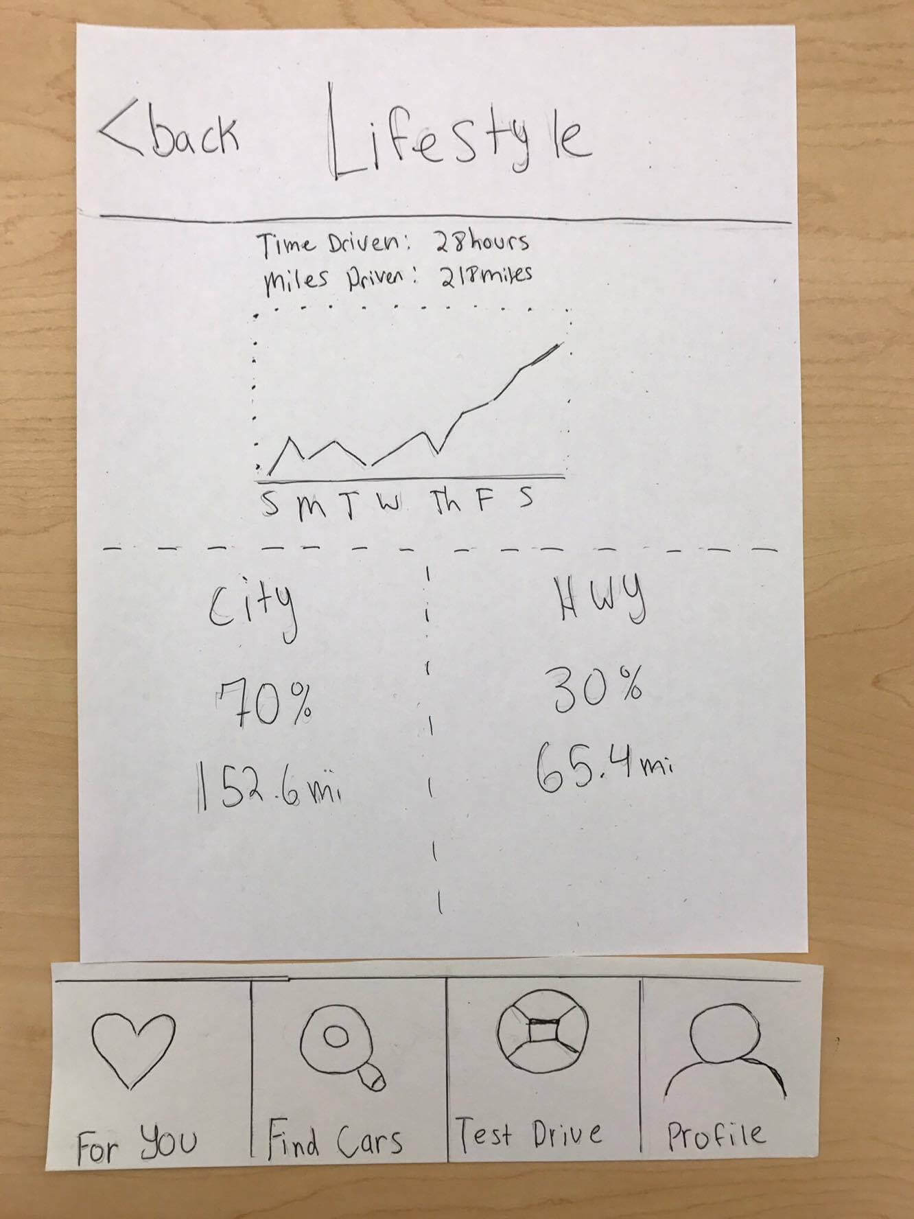
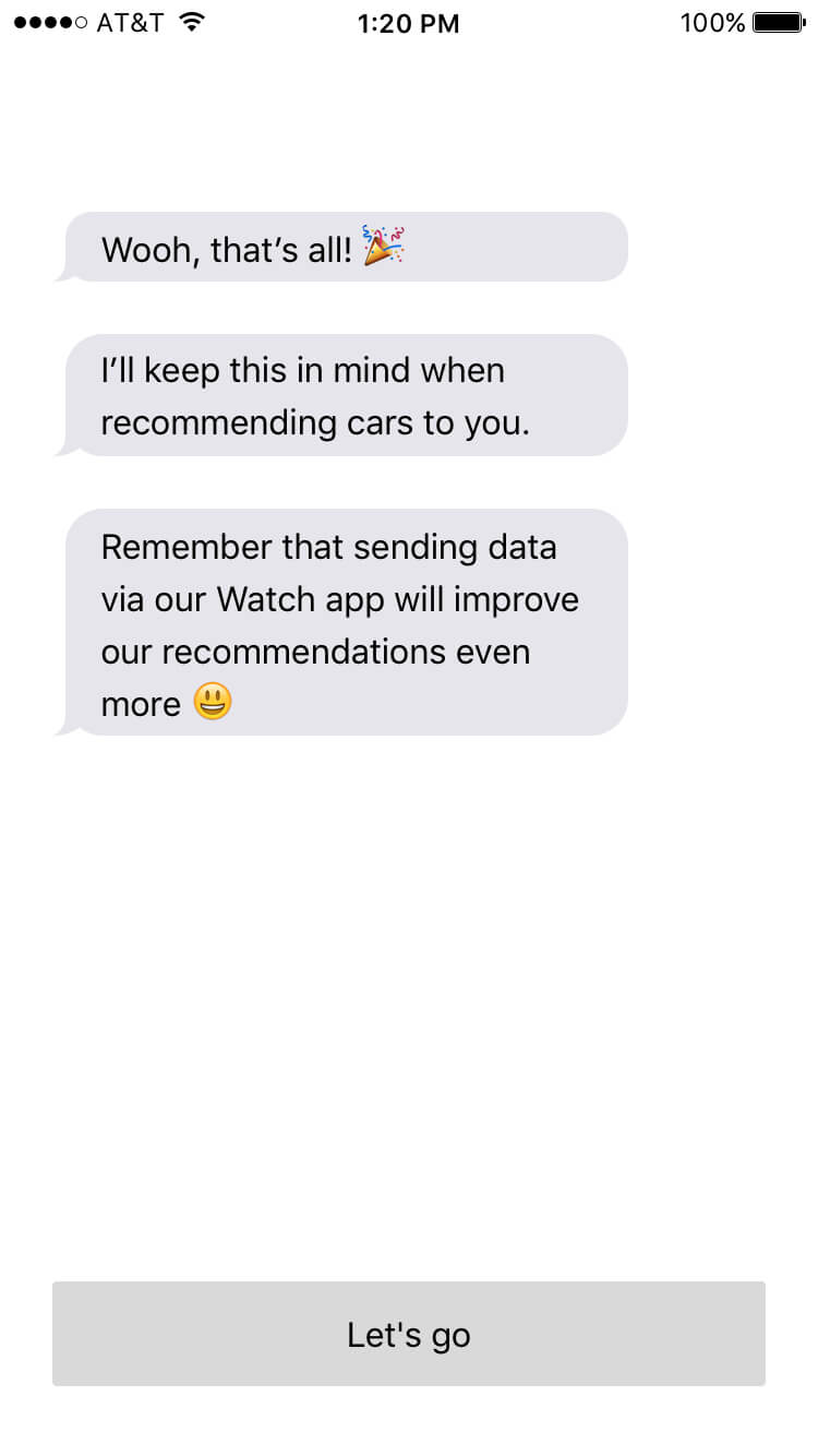
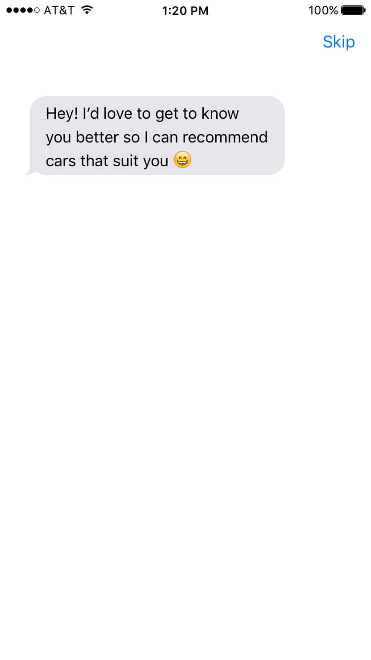
In our initial design, users could find a car in two different ways. One way was by picking a car from an automatically generated category. These categories were based on self-reported information about the user's personality as well as any driving data they had collected using the CarMax Apple Watch App.
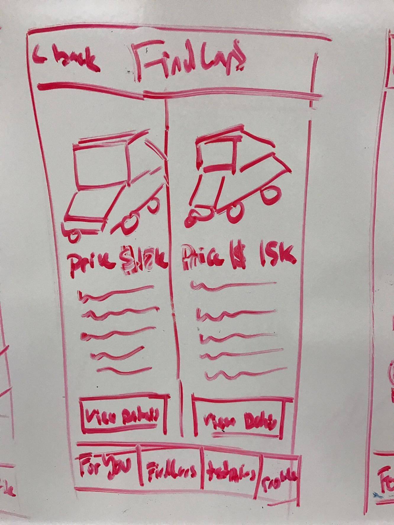
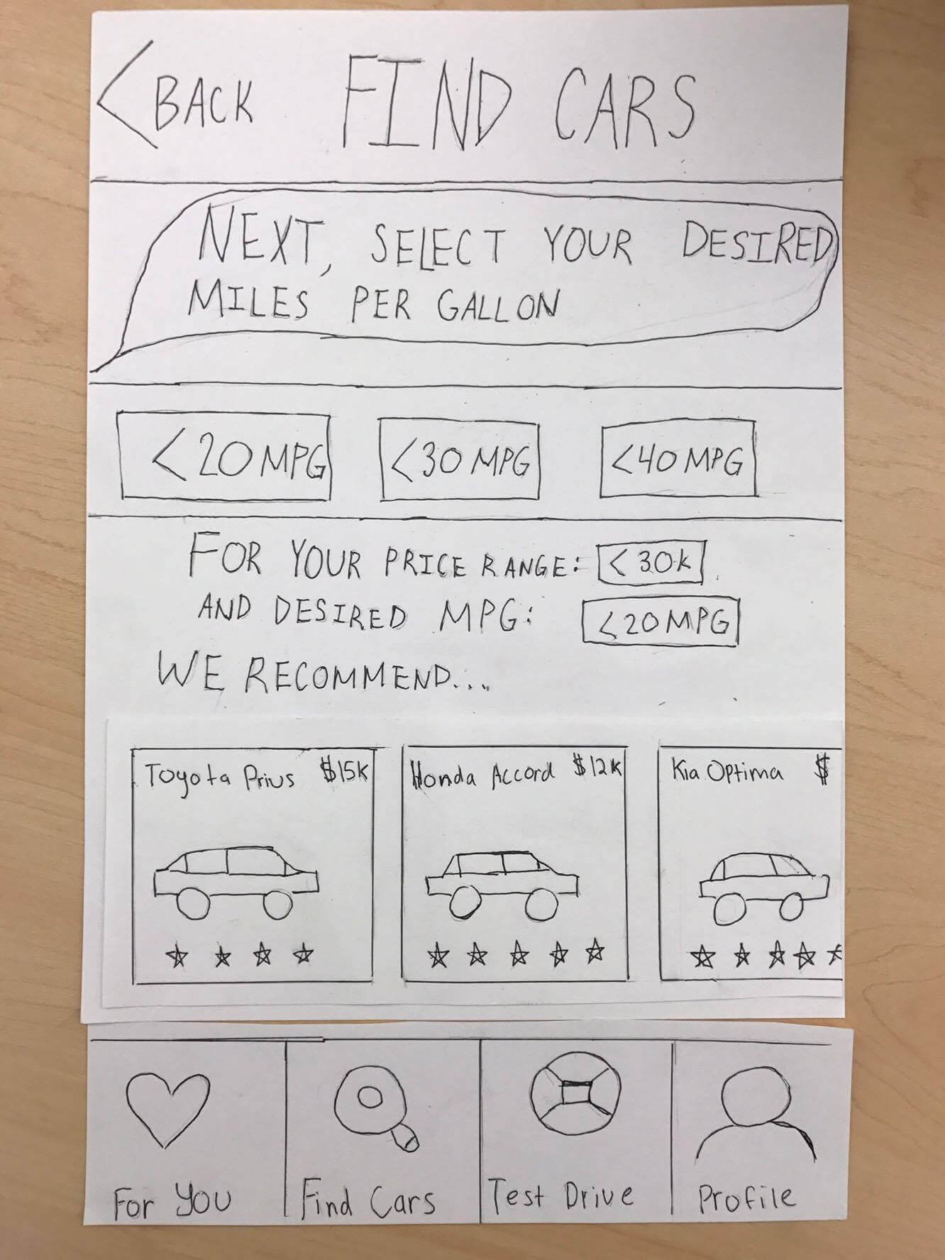
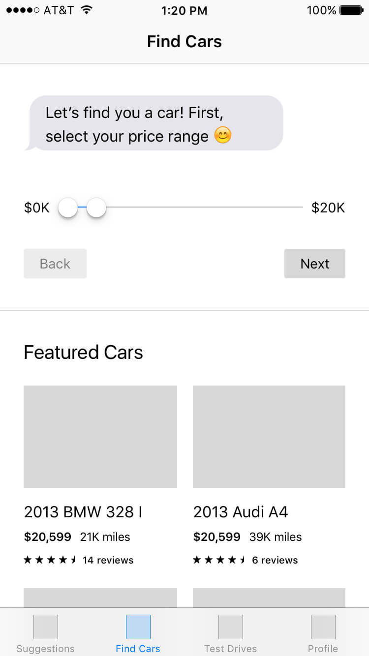
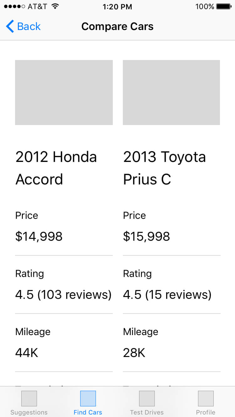
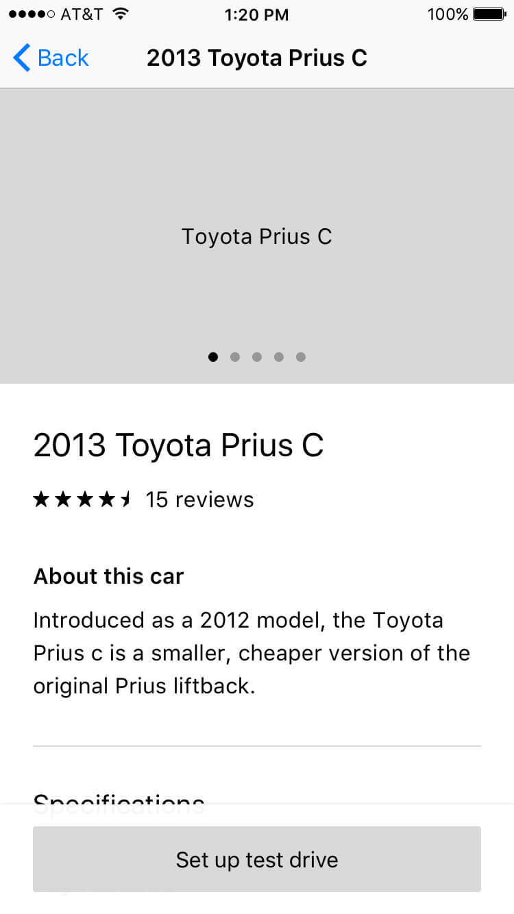
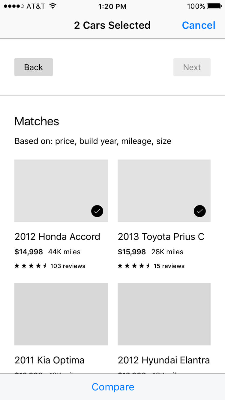
The other was to narrow down the selection of cars by answering questions about preferred requirements. If users did this, they were also able to compare cars to each other.
After showing our prototype to our professor, we realized that the two ways in which we enabled users to find a car were very similar to each other. We created another prototype that supported only one way of finding a car.
A conversation with Melissa, a User Experience Designer working on Amazon trade-ins, prompted us to make a new prototype. Melissa had expressed her concerns about the personality questions' effectiveness, using a chat-based interface, the language we used throughout the app and our app not adequately supporting the needs of people who are not familiar with technology and/or cars. We decided to address all of these concerns except for Melissa's concern about the chat-based interface.
Furthermore, we reduced the time users had to spend finding a car by replacing the app's question based filtering with a regular filter. Impulsively, we also removed our app's Apple Watch integration.
User testing (in which I was not involved) and presenting our work to the class made us realize three things: the number of filter options was overwhelming, our new solution made it impossible for users to find cars that fit their personality, and our app's Apple Watch integration, which we had just removed, was perceived as valuable and a unique selling point.
At this point, it felt like our iterations had only made our design worse. With one week to go until the submission deadline, we decided to use what we had learned to develop one more prototype.
Prototyping a better customer experience for people who are looking to buy a car taught me several things.
I learned that you have to be careful when conducting usability studies with prototypes. Our prototypes only supported a few ways in which important tasks could be completed. On top of this, Flinto highlights every tappable item when you tap on something that is not supposed to be tapped on. As a result, it was easier for users to complete tasks than it would have been had they been using a fully functional app. This made our usability study's results less valuable. I ended up discussing the problem with my professor. He suggested asking users what they think they should do when presented with a particular screen before actually letting them try this.
Moving fast sometimes means not making a decision right away, but carefully thinking about the problem, and how the feedback relates to it, first.
We used the feedback we received from users, but also from peers and full-time designers, to try to improve our app. Looking back, we wanted to respond to feedback too quickly. I realized that moving fast sometimes means not making a decision right away, but carefully thinking about the problem, and how the feedback relates to it, first. We incorporated a lot of feedback into our design that, had we considered it in the context of our problem, should have been ignored. For example, we removed our questions about the user's personality while we were trying to help users find cars that match who they are.
A lot of our ideas, once prototyped and tested, did not make the cut, but all of our iterations had something in common: none of them were a waste of time.
At the same time, doing this project made it clear to me that there is something to be said for a willingness to experiment and try new things. A lot of our ideas, once prototyped and tested, did not make the cut, but all of our iterations had something in common: none of them were a waste of time. Some of them were more successful than others, but even the less successful ones lead to valuable insights. For instance, as part of one of our iterations, we made it more difficult to find cars for specific personalities and removed the Apple Watch integration. These were considered to be bad moves. However, in that same sprint, we realized that we could change the app's filter mechanism and help users save time.
Lastly, I took away that language matters. For our prototypes, I used a lot of placeholder text that I had come up with while designing. For example, in our second prototype I talked about helping users find their 'dream' car. Melissa, the Amazon trade-ins designer, explained to me that language can be an important tool in making it easier for users to complete tasks. More importantly, she pointed out to me that not using the right language can distract users and negatively impact their experience. We talked about finding users' 'dream car', but what if they were just looking for the 'right car' instead? In that scenario, which was more than probable, users would perhaps think that our app was not for them. They could also be slightly annoyed by our lack of understanding, which would lessen their experience.