Amazon Trade-In
Summer 2017Design projects done while part of the Amazon Trade-In team.
August 2016
I was hired by Get There, a Dutch software company, to design parts of their new website within a month in the summer of 2016.
Get There was concerned that their website was not attractive enough to attract potential new hires and clients. I shared these concerns, but the team and I ultimately agreed that a bigger problem was that the website's design made it difficult for users to complete important tasks, like applying to an open position.
The project team consisted out of five people in total. The project manager and I were responsible for the delivery of the designs. Overseen by the project manager, I prepared and gave weekly presentations to the other team members about the progress we had made the prior week.
The first days of the four week period we had to complete the project were used for research. I Get There's Google Analytics data and summarized my findings in a report. In addition to this, I conducted a simple competitor analysis to find out how our competition used their websites to set themselves apart. As a team, we made a collection of websites that solved problems that we had to solve in the near future elegantly.
Next, I mapped out the existing website's page structure and included information about what content could be found where. I used this document in combination with the Google Analytics report and conversations I had with engineers, recruiters and one of the two CEOs to make a proposal for the new website's sitemap.
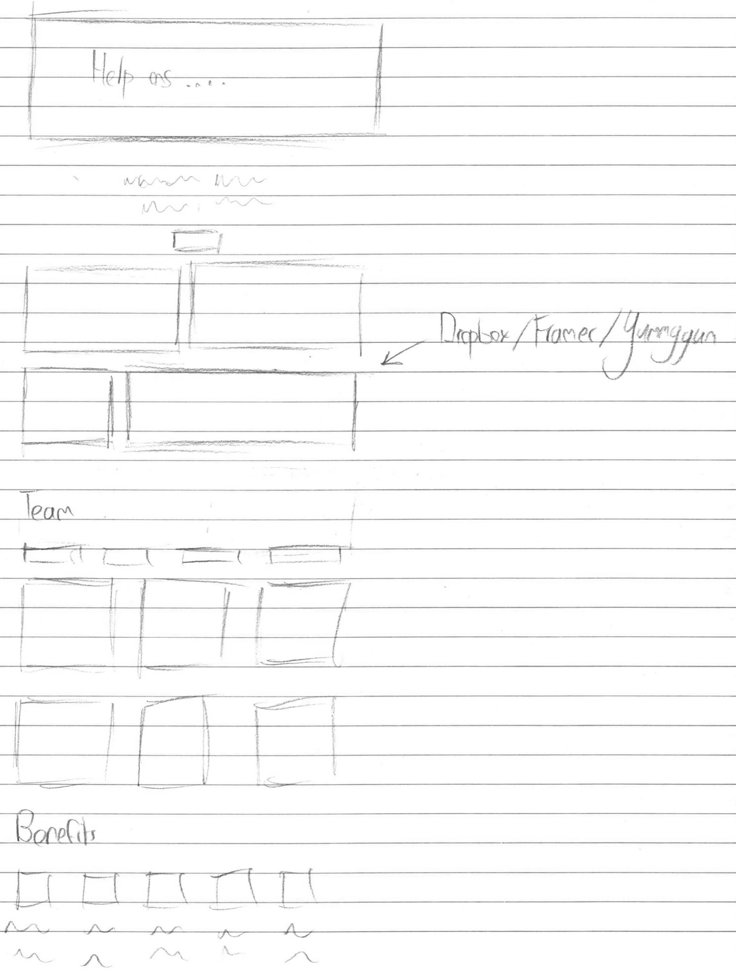
It was difficult to validate the new page structure with only a spreadsheet. For this reason, I made sketches and created wireframes. These wireframes also enabled me to already test for potential user experience problems. I made several iterations of the wireframes and incorporated the team's feedback into my work.

Ultimately, I created high fidelity designs based off the wireframes. Get There did not have enough photos that I could use for the designs, so I helped coordinate the creation of the photos that were used as hero images.
I shared early versions of the design with the Spec.fm team and received feedback on it from Brian Lovin, Bryn Jackson, Gabriel Valdivia and Diana Mounter. I was able to greatly improve my designs thanks to this feedback.
In my free time, I used FramerJS to imagine how motion could be used to make the website's design more appealing. I recorded my interactions with these prototypes to speed up the development process that would follow when I would be back in the United States.
The final deliverables were a sitemap, designs for several pages, three (videos of) prototypes and a style guide.
On my final day, I presented my work to the rest of the company. This presentation helped get the greenlight for the project's continuation.
Working at Get There has made a me a lot better at design thinking and designing away from the computer for as long as possible. The feedback from Bryn Jackson et al. reminded me that, regardless of the quality of your process up to that point, it is easy to lose sight of users' needs and goals at any stage in a project.
Above all, my time at Get There has made me aware that the design process perhaps benefits more from soft skills, like listening, presenting and giving/receiving feedback, than design skills.
