

Amazon Trade-In
Summer 2017Design projects done while part of the Amazon Trade-In team.
Fall 2015
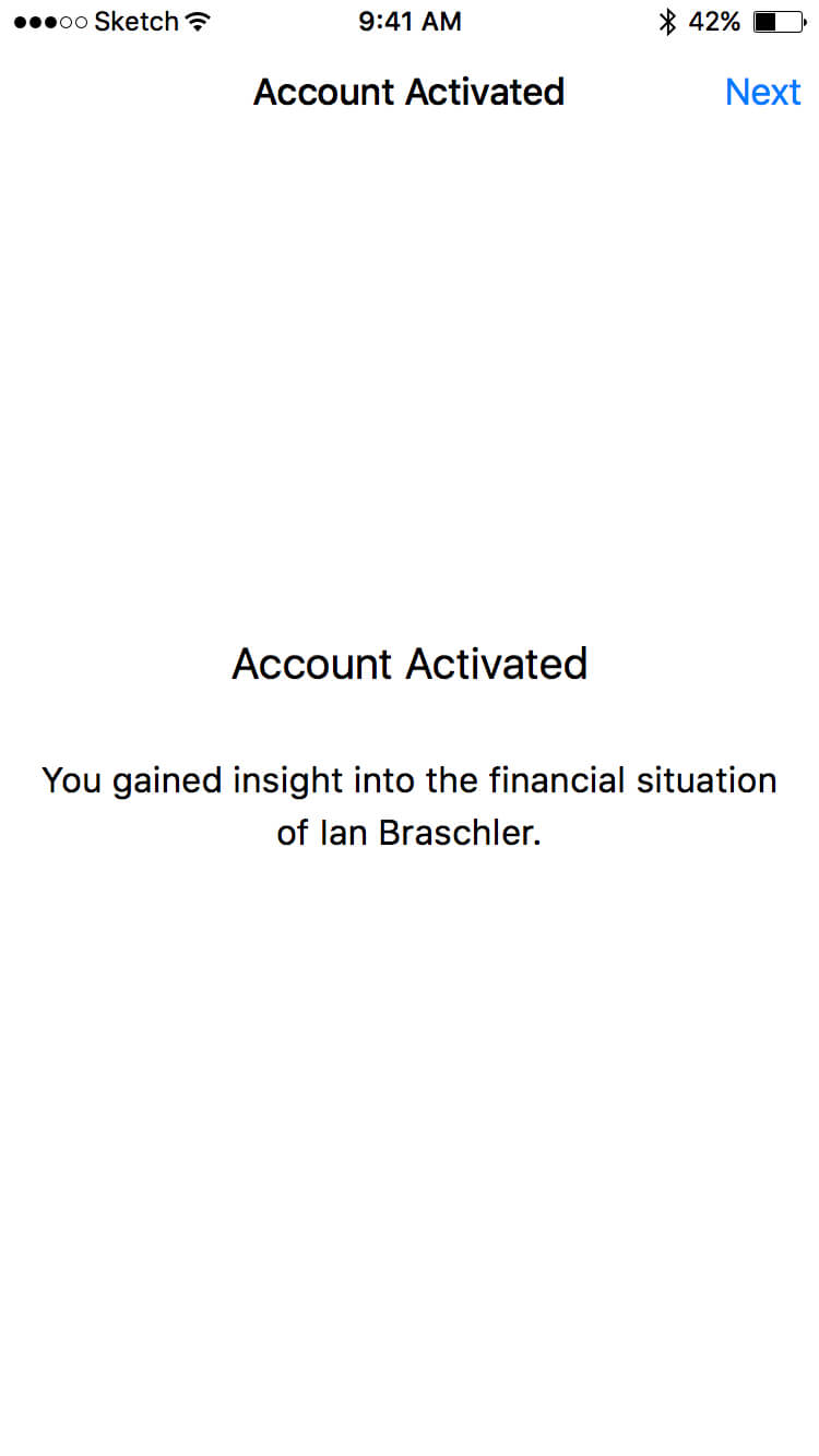
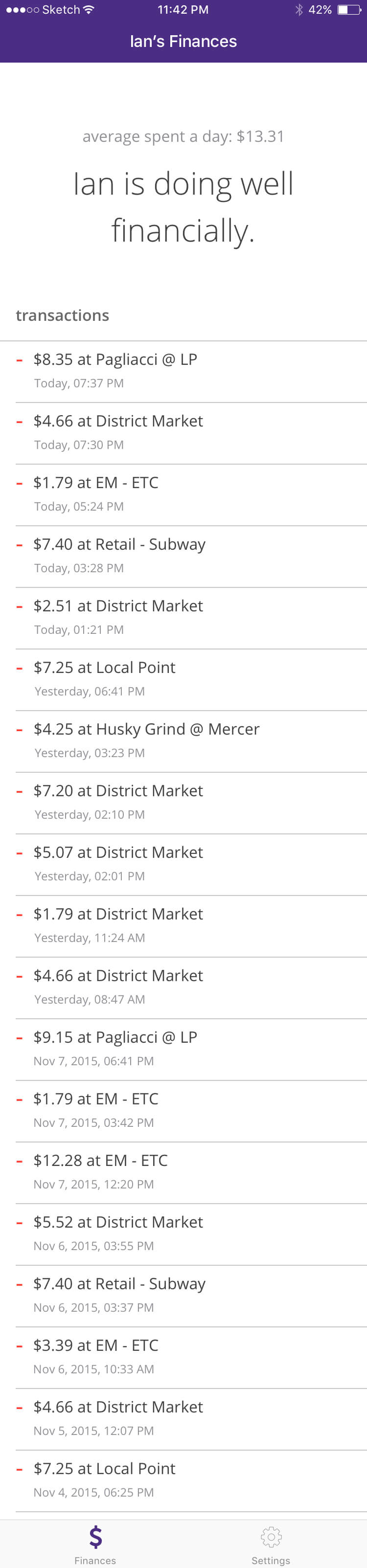
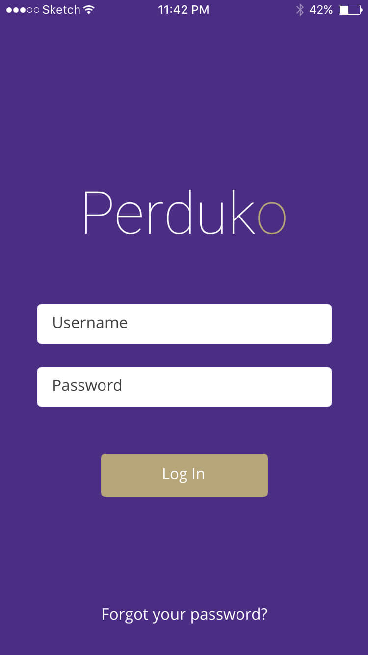
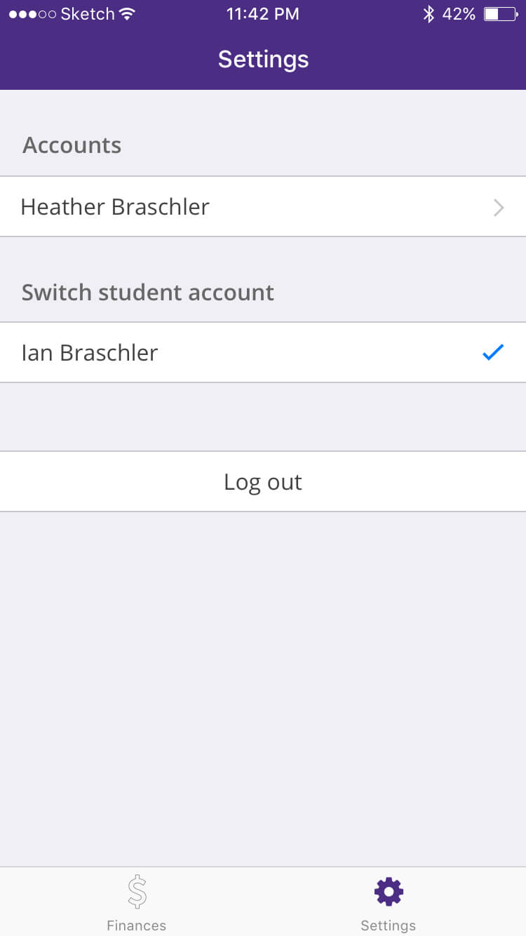
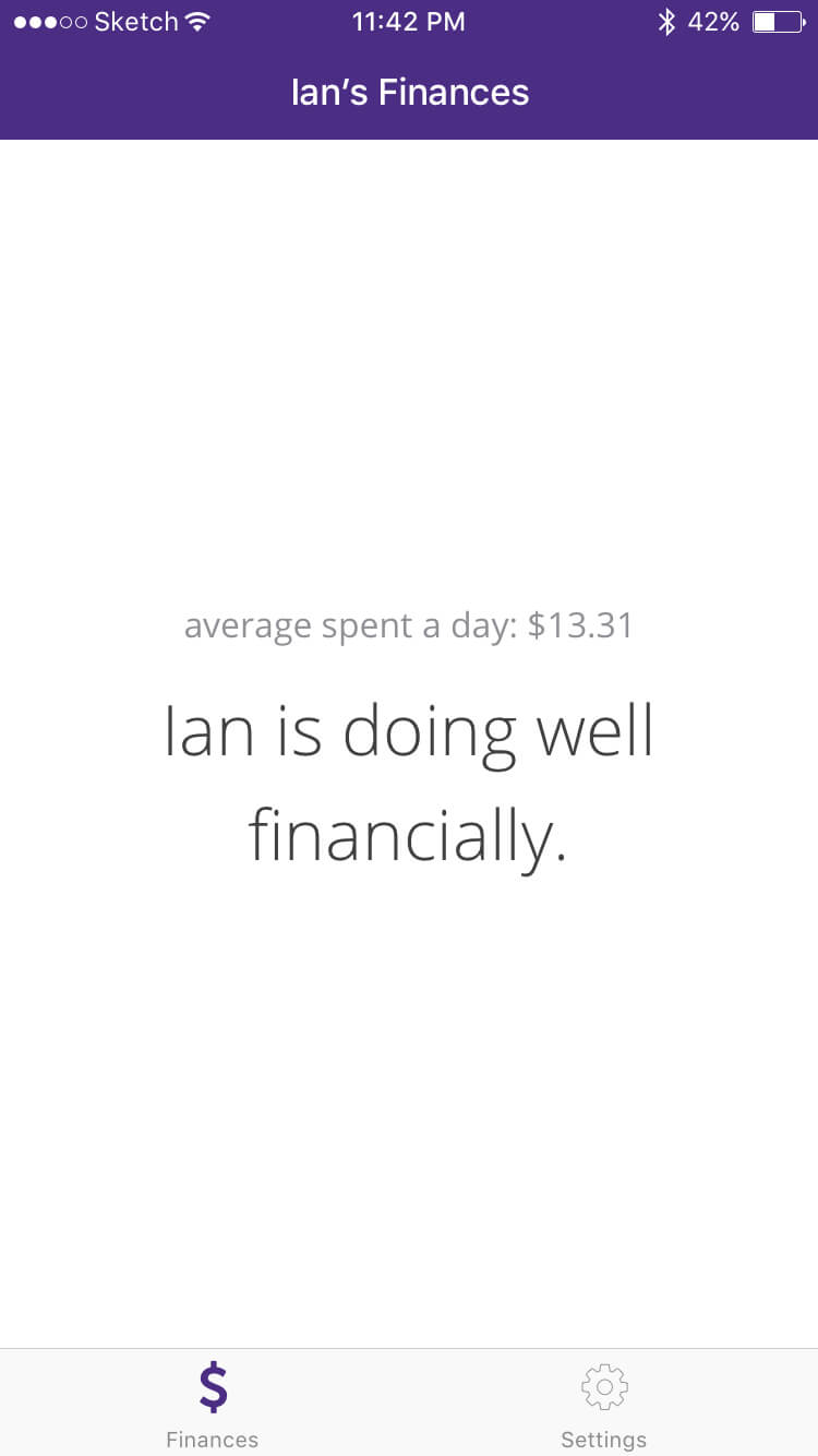
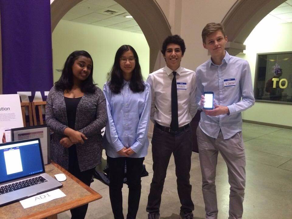
For the final project of the class INFO 200, I designed a financial management app, Perduko, together with Jared Trelles and Helene Shea. Our goal was to help University of Washington students manage their finances and share information about their financial health with their parents.
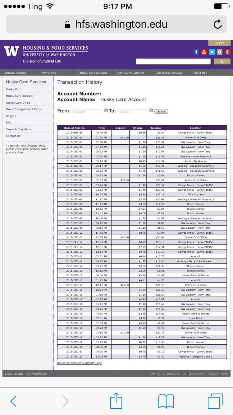
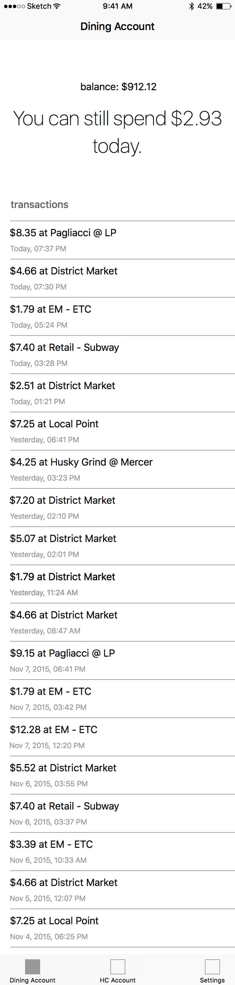
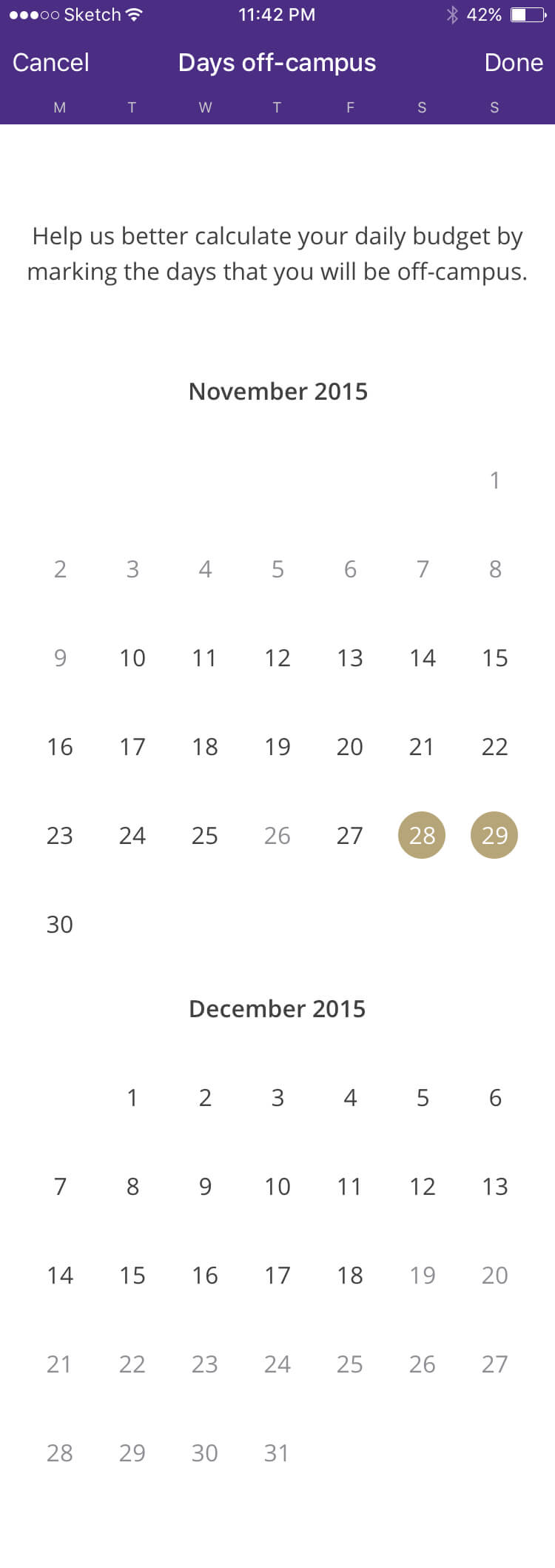
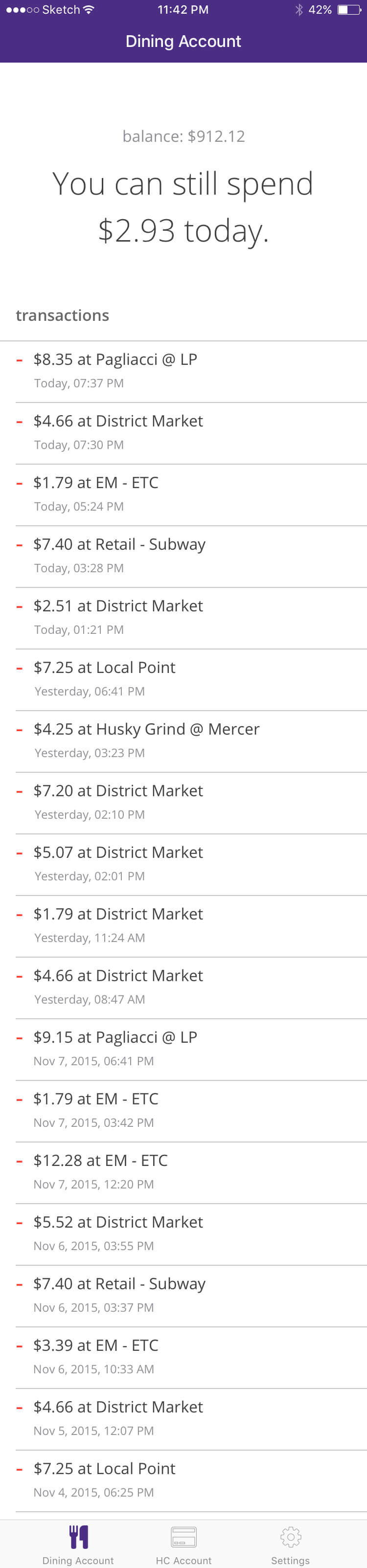
Students who live on campus have to purchase a dining account. They can use the money that goes towards this dining account, which is at least $82 per week, to pay for food on campus. A small sum of this money goes to their Husky Card account, a second account that is used to pay for laundry and printing with.
At the start of the quarter, every student gets access to their dining account and Husky Card account money. They can pay with their accounts by presenting their student card.
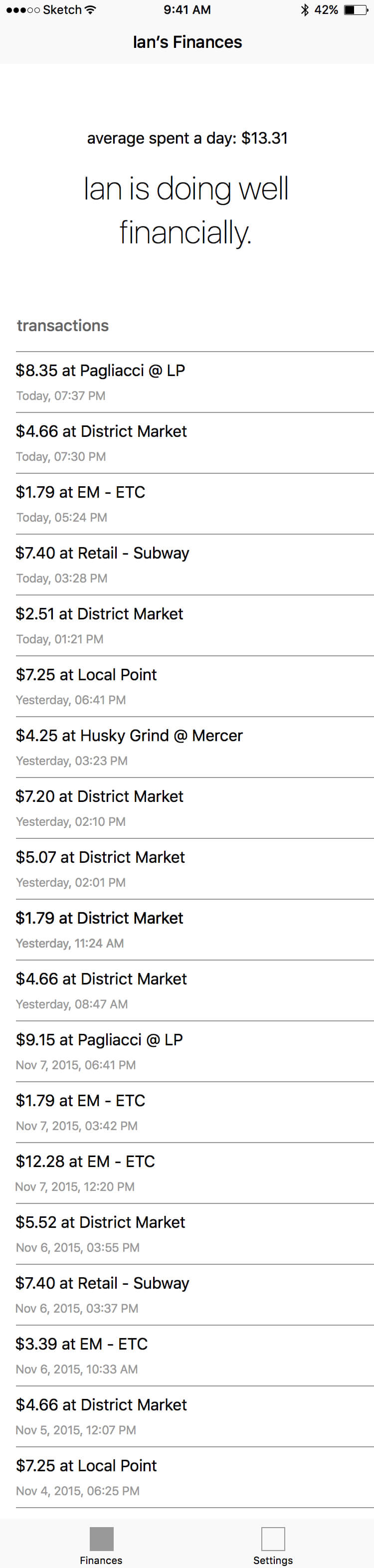
We hypothesized that this system results in stress for students. Our reasoning was that students have access to at least $700, but do not know how much money they can spend a day. We imagined that they also do not know how much money they actually spend a day and what they spend their money on.
Once we had defined the problem, we looked at existing solutions to it. Among other things, we discovered a tool that tried to tackle at least one of the subproblems we had set out to solve. This tool presented students with both their Husky Card account and dining account transaction history. As a result of the large number of steps that users had to take to access it, not a lot of students knew about its existence however. The experience was also not designed with mobile devices in mind.
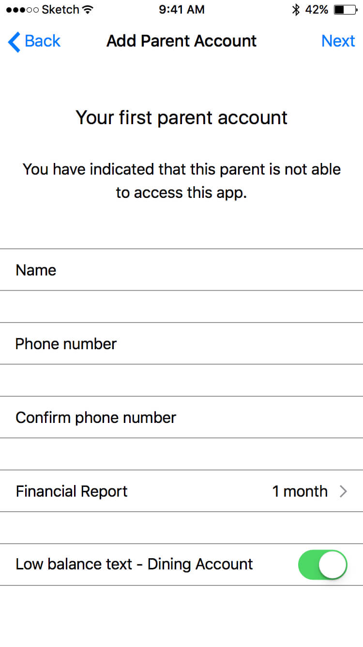
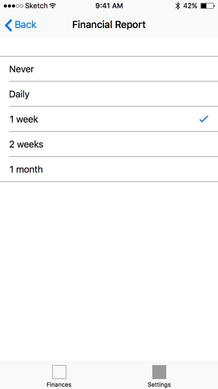
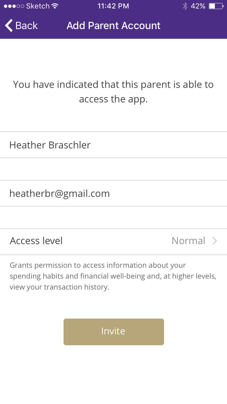
While planning user research, we considered the problem that parents are not able to look into their child's financial situation even if their child wants them to. We added this problem to our list of (potential) problems and started to conduct user research.
It was our goal to interview members of both of our stakeholder groups: students and parents. Ultimately, we used our interview transcripts as the foundation for our personas. We wanted to make our app accessible to more 'extreme' users. For this reason, we created personas for users with little financial means and poor vision.
A document with an overview of our personas can be downloaded here.
We started off by making sketches, wireframes and two simple prototypes so that we could test our ideas without having to use a lot of resources.
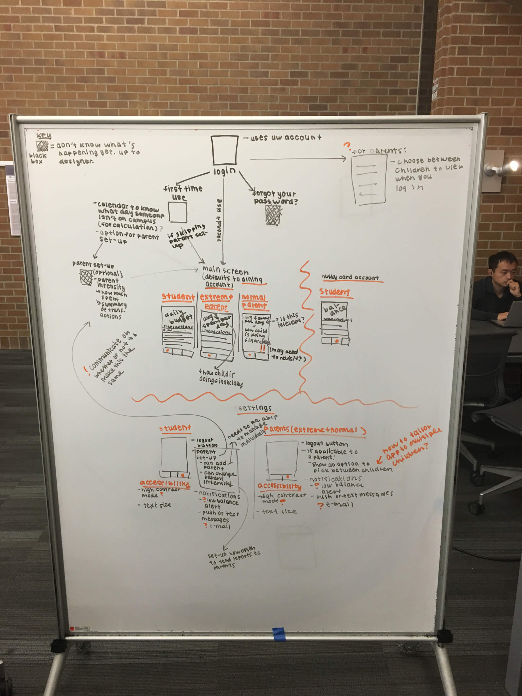
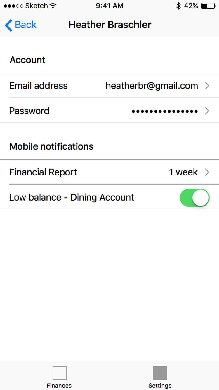
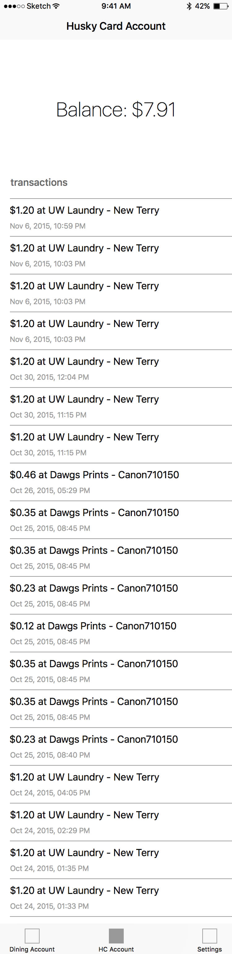

Using our wireframes as a starting point, we made the final designs and prototypes for Perduko.
View our final prototype of the student's view of the app
The final prototype of the parent's view of the app is currently unavailable
Designing Perduko has taught me that, ideally, user research is done at multiple points in the design process. We should have done user research up front and also made the mistake of not letting users interact with our prototypes.
Another thing I learned is that it is difficult, yet crucial for a product's development, to conduct interviews with unbiased users. Some of our interview participants were close friends and as a result we can not be sure that we solved a real problem.
One of the most important takeaways of this project, is how to design for users that are not the average user. To quote Dan Formose, co-founder of Smart Design, "What we really need to do to design is look at the extremes. The weakest, or the person with arthritis, or the athlete, or the strongest person, or the fastest. Because if we understand what the extremes are, the middle will take care of itself."

