

Scout
2016Contributions to an app that helps University of Washington students find resources on campus.
Winter 2015
http://creativeaid.vincentmvdm.com/
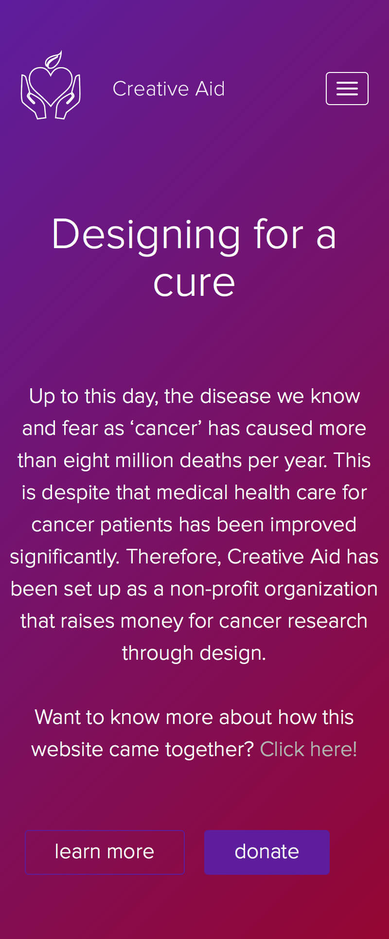
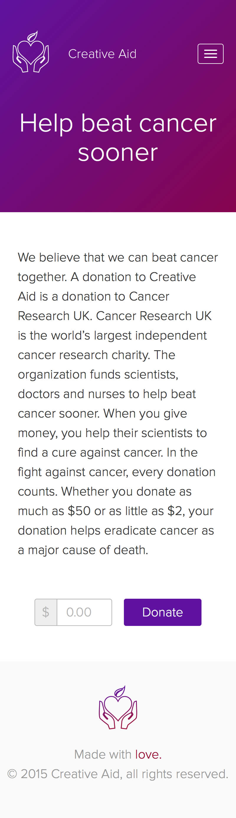
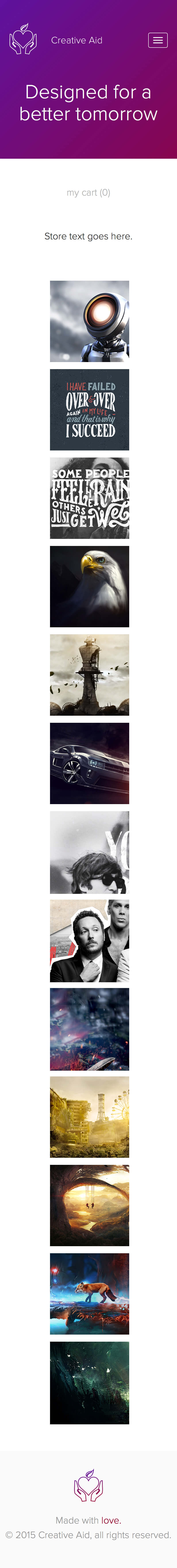
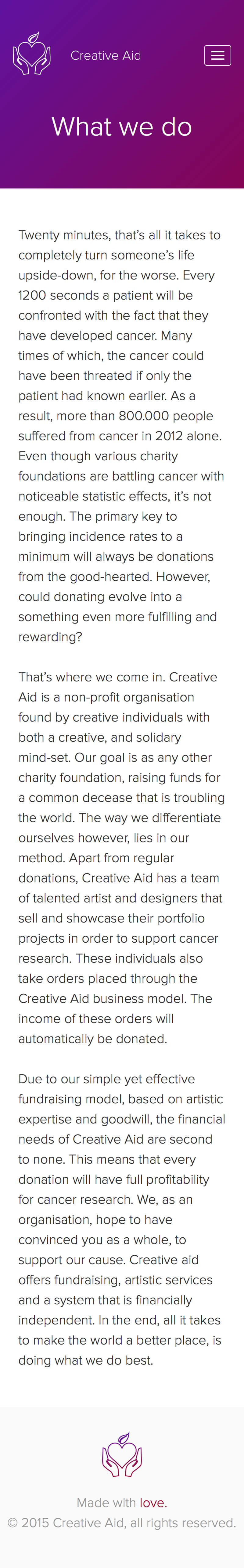
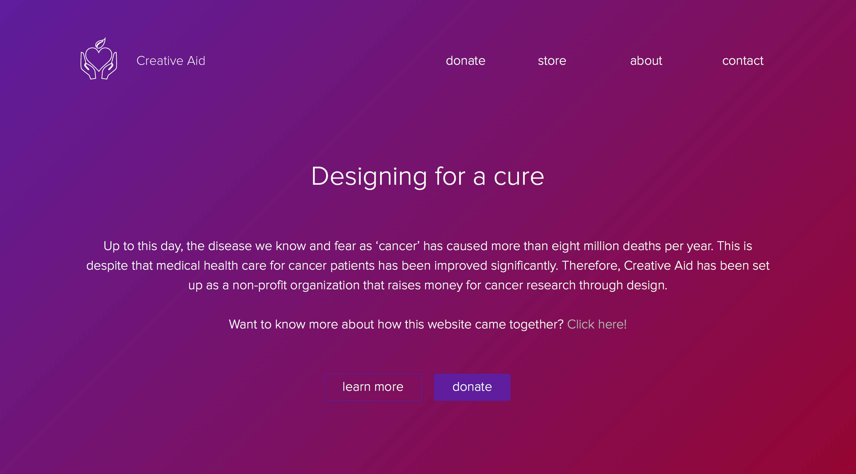
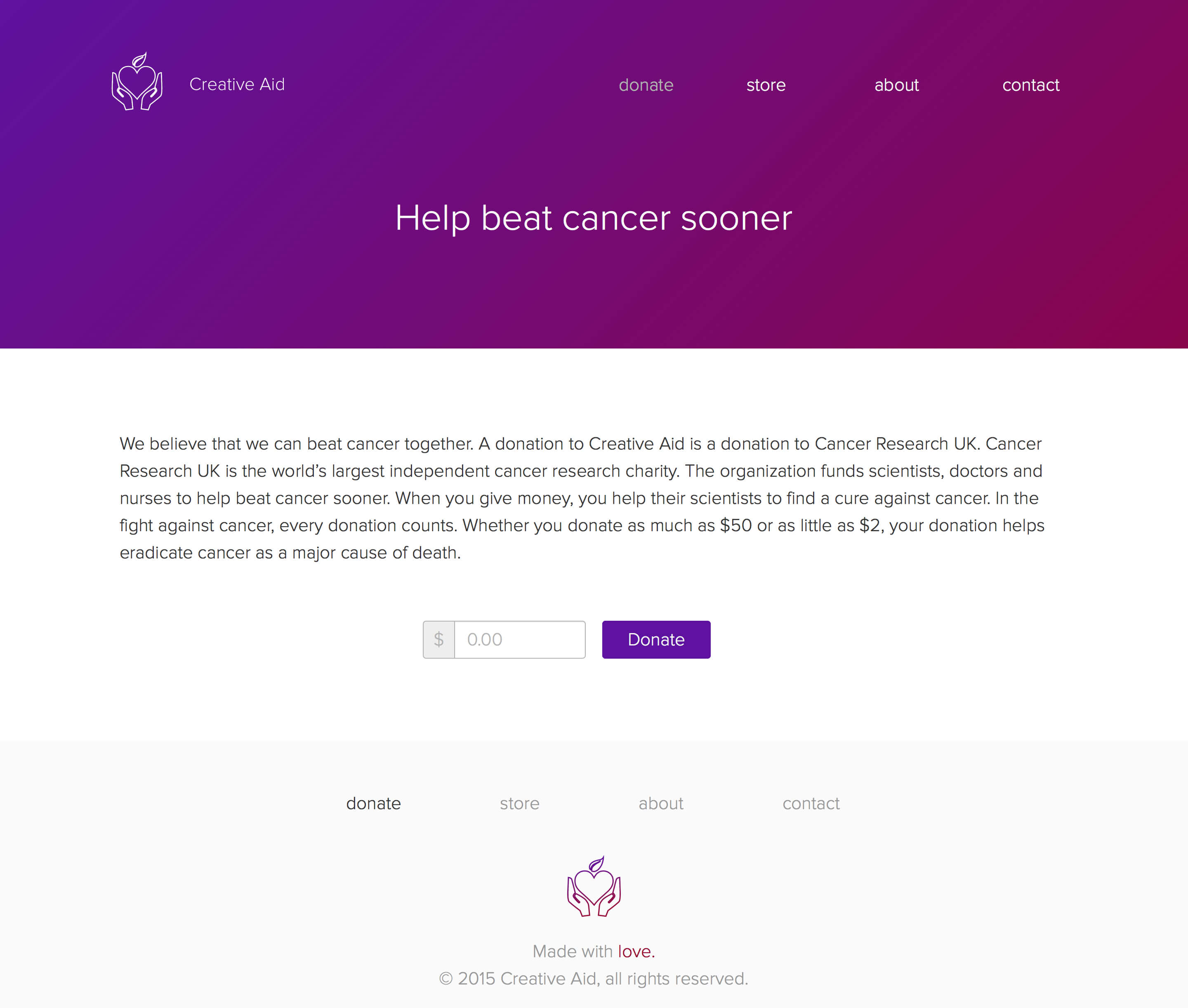
Martin Kamminga and I ran a nonprofit organization called Creative Aid (formerly known as GFX4Cancer) in high school. Creative Aid used graphic design to raise money for cancer research. In our senior year, we designed and developed a website for the organization as part of our Computer Science class.
We used the waterfall software development method Cap Gemini SDM. For this reason, Martin and I focused on logistics for the first weeks of the six months period in which the project had to be completed. We defined what requirements our website had to meet, timeboxed every activity and started to think about the database's design as well as tests we would ultimately have to conduct.
Martin and I created the initial designs over the course of several weeks of Computer Science classes. We eventually converted these draft designs to high fidelity designs, after which we started development.
We were both responsible for different parts of the development process. I was responsible for the website's back end (PHP and SQL). Martin was mostly concerned with its front end. In the end, I connected the website's front end to its back end while Martin started to conduct tests and write documentation.
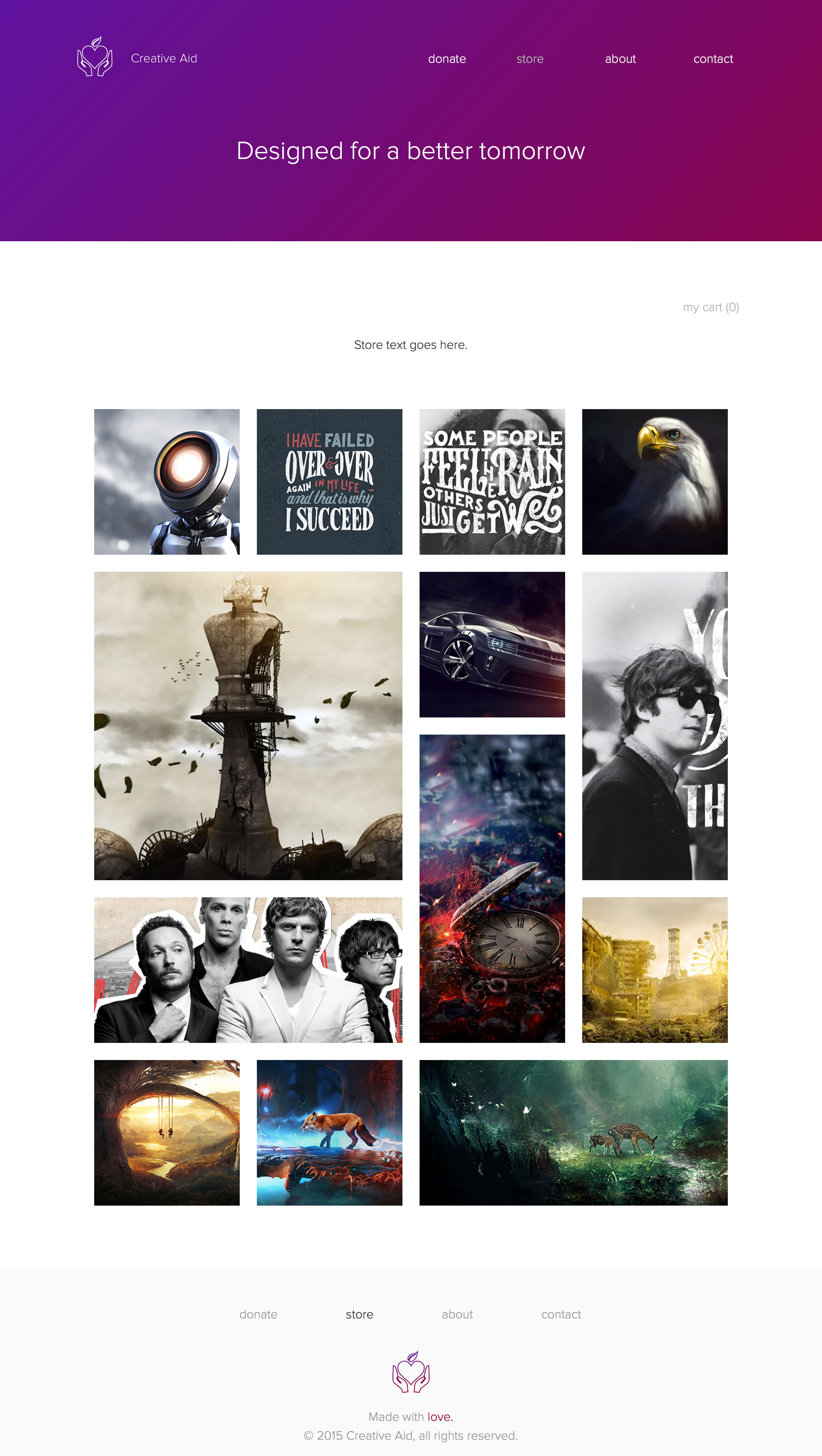
The website had to support four use cases: users had to be able to learn more about cancer, donate money to Creative Aid, order prints and contact the organization.
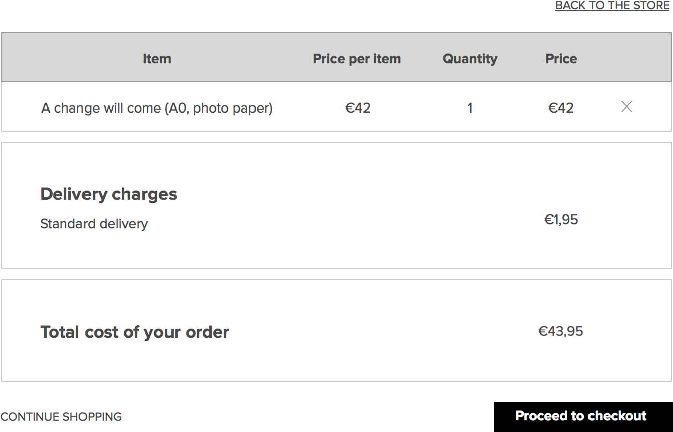
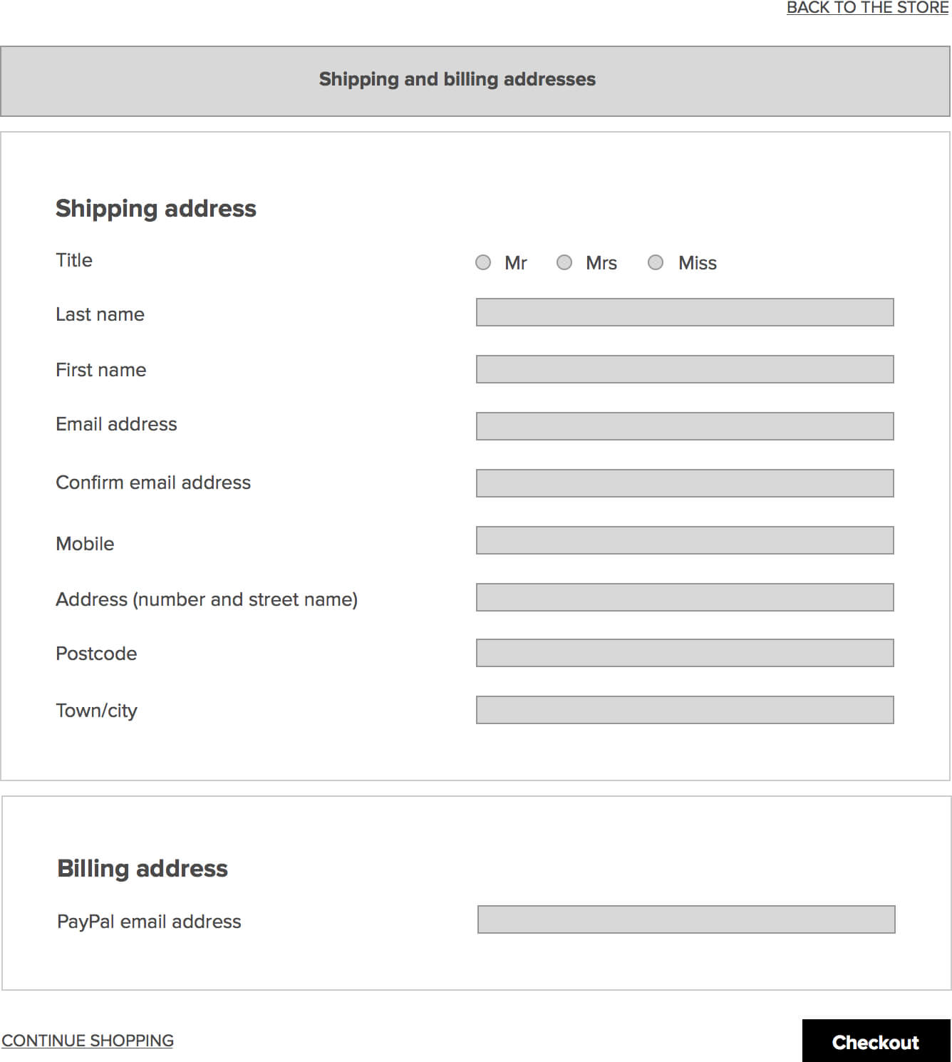
Prior to the design phase, I made wireframes to get an idea of how users might use Creative Aid's website to order a print.

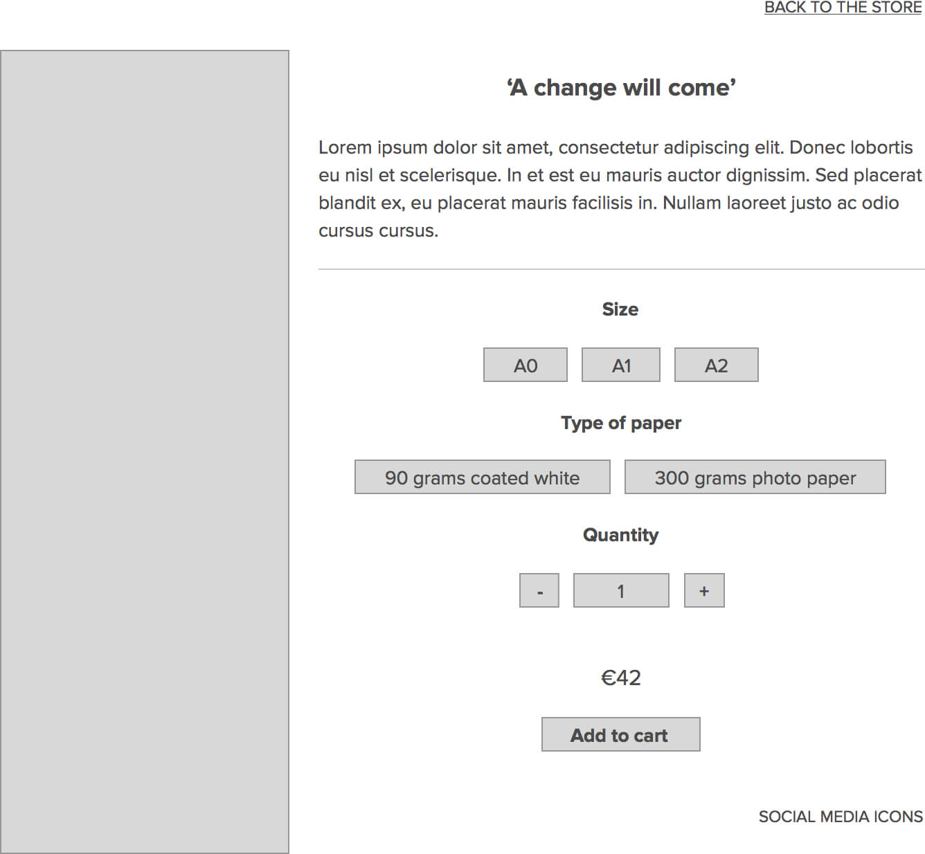
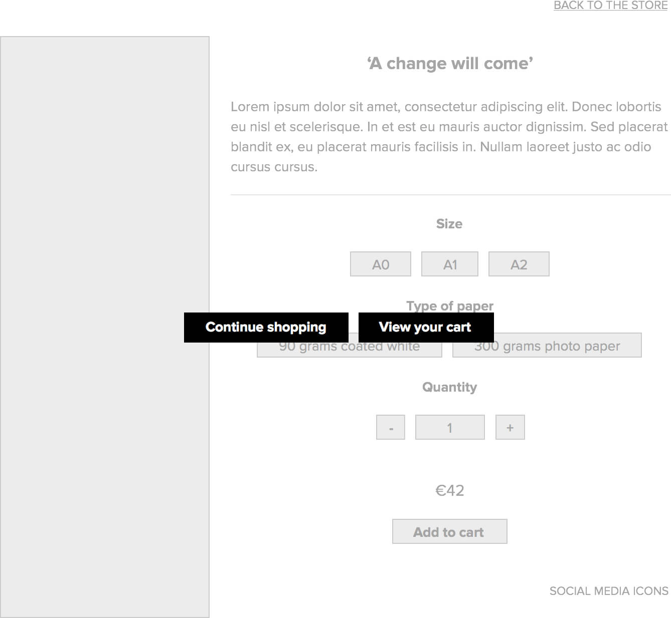
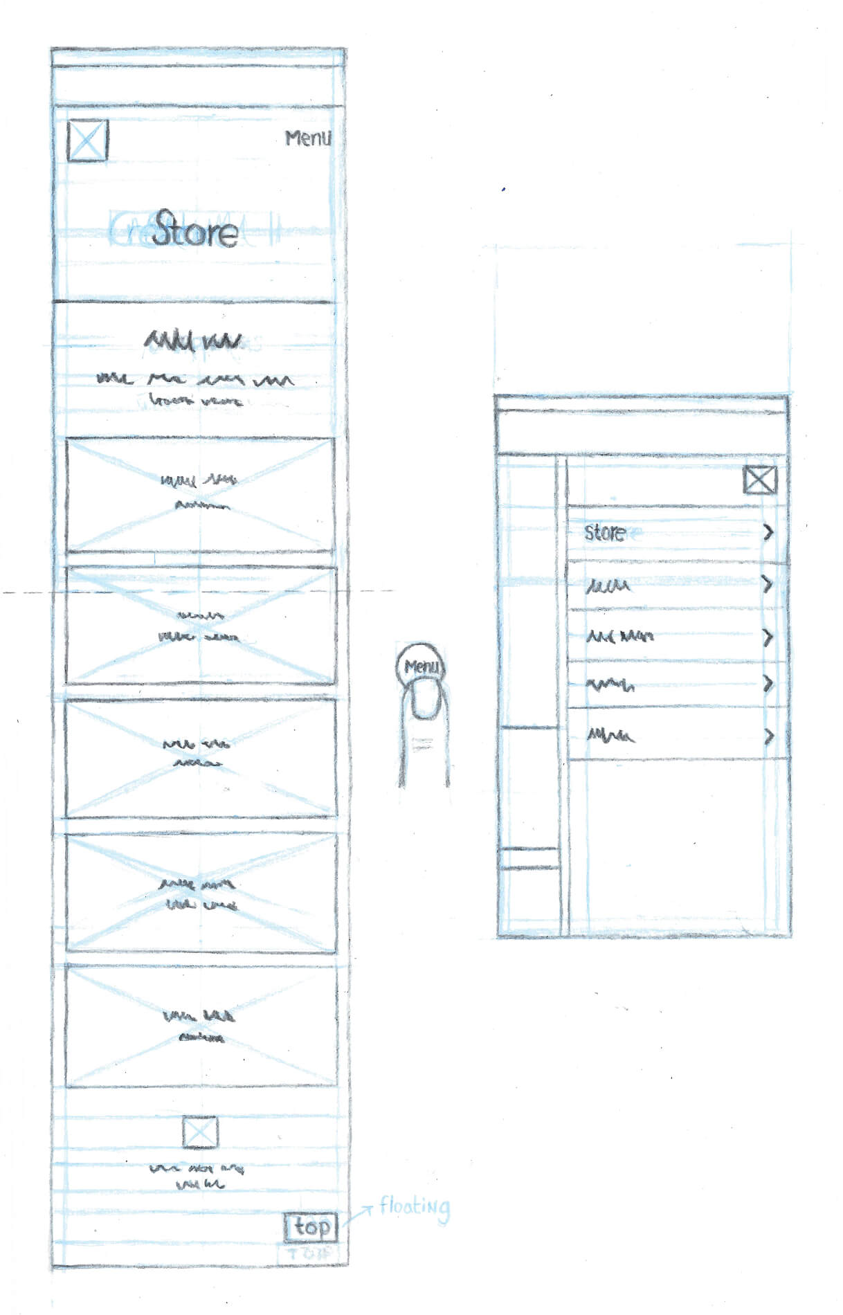
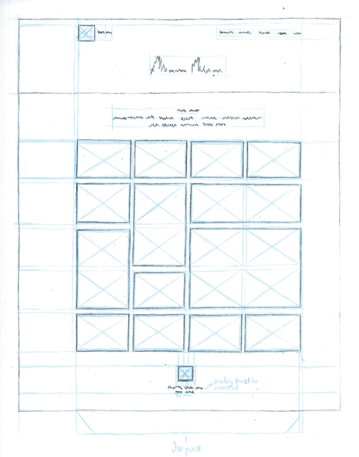
After we finished an early version of the website's design for desktop, I made sketches to explore what the 'store' page eventually had to look like.
We had to overcome several technical challenges while developing the website. Martin had limited experience as a developer and I was more familiar with front end development than with back end development.
It was especially difficult to make our website secure, since we wanted to create its store from scratch. It also proved to be difficult to implement the store's masonry layout.
From a design perspective, there is a lot that I would do differently. At the time of this project, which was completed in Winter 2015, I was not familiar with User Centered Design. We did not define a problem nor did we research our users' needs and desires. (As a result) virtually all of our design decisions were made with the company, and not the user, in mind. Furthermore, we did not do any user testing. If I were to do this project again, I would try to take a more user focused approach.

